


User Comments
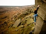
Thanks to Sean and Swain16 for their comments on an earlier version. Background lightly defocussed afterwards to get that fast lens effect.
Dan Arkle - 17/Aug/09
I haven't seen ther earlier version but the DOF looks a bit harsh, as if you've photoshopped the in focus section onto the background. Good composition though.
galpinos - 17/Aug/09
Background looks too unfocused.
Jonny Tee 69 - 17/Aug/09
Yes definately too blurred - it looks like one of those old fashioned 3d pics
The Pylon King - 17/Aug/09
Nice pic, What gear did you use?
MorganPreece - 18/Aug/09
That`s how I see things ( bit short sighted see ) fantastic :~)
mr mills - 18/Aug/09
Thanks for comments. Look like I overdid it a bit. The original just seemed so flat so I thought it may give it more depth. Canon IXUS 850is
Dan Arkle - 20/Aug/09
I would try another version cutting it in half and making it portrait shape. Try it and see what you think, you don't have to post it if it does not look right to you.
sutty - 23/Aug/09
Maybe try a gradient mask on the blur so it's not as harsh in the foreground as it is on the horizon. I think it looks too harsh as the background blur is so uniform. Great capture tho!
Paul Phillips - UKC and UKH - 24/Aug/09
I agree with sutty, chop it in half so there is more of the picture in focus, than there is out of focus. The blur might work / compliment more then.
Excellent capture though.
PJ - 25/Aug/09
Excellent capture though.
"Too unfocused", "Defocus it", "Chop it in half", " Gradient mask", blah blah blah.
Jesus.
simes303 - 25/Aug/09
Jesus.
That hat is a bit brown.
Facewest.co.uk - 27/Aug/09
If the background had been more focused you had more depth of field. Otherwise a good picture.
halo - 24/Sep/10