This topic has been archived, and won't accept reply postings.
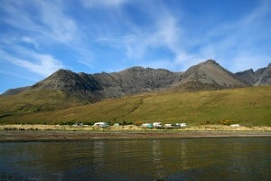
El Chorro has dropped off the winter sun target radar for Brits over the last few years. Fuelled by rumours about access problems many have set their site on the alternative reliable climates of the Costa Blanca or Mallorca. The area appears now to be set for a comeback with plenty of new crags to go at plus a glossy new guidebook.
Ben Heason has a look at the new El Chorro guidebook from Rockfax and gives us his verdict.
Read the review here - http://www.ukclimbing.com/gear/review.php?id=1571
Ben Heason has a look at the new El Chorro guidebook from Rockfax and gives us his verdict.
Read the review here - http://www.ukclimbing.com/gear/review.php?id=1571
In reply to UKC Gear:
"Concerning front covers, presumably the grade of a route is pretty irrelevant; whether it inspires you to open the guide, and further inspires a visit to the area is important."
Fair point Ben....i was honestly thinking that this pic of mine:
http://www.ukhillwalking.com/images/dbpage.php?id=105529
is better than most of the shots in the guide (though no one has voted...) and i am just a photographic punter. What was Nick doing? :0
I would however add that it is an excellent guide and this is a minor point. It's particularly good to see all the "?" for route grades and names were filled in.
In reply to Morgan Woods:
That must be staged...there's no way that fat and (nearly) old git could get up a 7b+...
Anyway, more constructively, I agree with the comments re the photos, especially the cover...what *were* they thinking about - it might have been just about OK for the Spur Book of Climbing 1967, but for a major Eurocrag like Chorro that cover photo was rubbish.
In reply to Nic:
classic!
anyway i wouldn't say the cover is rubbish.....but it isn't exactly inspring and is squarely at the punter end of the market. I think my ideal cover model would be younger, hotter, from eastern europe and preferably putting the clips in some 8a+....err hang on i've said too much.
> (In reply to Morgan Woods)
>
> That must be staged...there's no way that fat and (nearly) old git could get up a 7b+...
>
>
> That must be staged...there's no way that fat and (nearly) old git could get up a 7b+...
>
classic!
anyway i wouldn't say the cover is rubbish.....but it isn't exactly inspring and is squarely at the punter end of the market. I think my ideal cover model would be younger, hotter, from eastern europe and preferably putting the clips in some 8a+....err hang on i've said too much.
In reply to Al Evans:
Wash yer mouth out...
And give us yer credit card!
Mick
> (In reply to UKC Gear) Strange that we see a good review for a Rockfax guide on here
Wash yer mouth out...
> I will be buying it though
And give us yer credit card!
Mick
In reply to Morgan Woods:
I disagree - even as an aspiring punter that cover didn't make me want to book a flight to Málaga...more like "hmm, I wonder what Stoney Middleton's like this time of year..."
Otherwise your suggestions were spot on...
> squarely at the punter end of the market.
I disagree - even as an aspiring punter that cover didn't make me want to book a flight to Málaga...more like "hmm, I wonder what Stoney Middleton's like this time of year..."
Otherwise your suggestions were spot on...
In reply to Nic:
really.....Chorro, christmas day, shorts and t-shirt.....nuff said!
> (In reply to Morgan Woods)
>
> [...]
>
>
> I disagree - even as an aspiring punter that cover didn't make me want to book a flight to Málaga...more like "hmm, I wonder what Stoney Middleton's like this time of year..."
>
> [...]
>
>
> I disagree - even as an aspiring punter that cover didn't make me want to book a flight to Málaga...more like "hmm, I wonder what Stoney Middleton's like this time of year..."
really.....Chorro, christmas day, shorts and t-shirt.....nuff said!
In reply to UKC Gear: I've got a mint copy of the one produced by the local climbers, that is sold locally. Its best one I have seen of the ones I have looked at. Haven't seen the latest RockFax one.
Willing to sell it for £10 plus postage.
In mint order, as I found the shop that sold it on the last day (last summer).
Willing to sell it for £10 plus postage.
In mint order, as I found the shop that sold it on the last day (last summer).
In reply to UKC Gear:
An alternative review can be found here:
http://www.climbonline.co.uk/reviews.htm
Regards
Steve Crowe
An alternative review can be found here:
http://www.climbonline.co.uk/reviews.htm
Regards
Steve Crowe
In reply to Morgan Woods:
Do you imagine anyone wouldn't open a guidebook or dismiss an area just because the cover shot didn't fire them up?
When I was working on Lofoten Rock with Thorbjørn Enevold he was concerned that we didn't have the 'perfect' cover that totally encapsulated the place. I had to tell him, it didn't really matter - its the stuff between the covers that is all important.
Chris
> (In reply to UKC Gear)
>
> "Concerning front covers, presumably the grade of a route is pretty irrelevant; whether it inspires you to open the guide, and further inspires a visit to the area is important."
>
>
> "Concerning front covers, presumably the grade of a route is pretty irrelevant; whether it inspires you to open the guide, and further inspires a visit to the area is important."
>
Do you imagine anyone wouldn't open a guidebook or dismiss an area just because the cover shot didn't fire them up?
When I was working on Lofoten Rock with Thorbjørn Enevold he was concerned that we didn't have the 'perfect' cover that totally encapsulated the place. I had to tell him, it didn't really matter - its the stuff between the covers that is all important.
Chris
In reply to Chris Craggs:
Not at all Chris, so i hope you don't mind my cheeky comparison. I think the reviewer noted that it was a minor point and I agreed. The content is superb and was a joy to use out there. My main gripe was not being able to get my hands on one before my trip and borrowing other peoples copies, although I did hear Mark was flogging copies to people at the crag like some travelling Rockfax salesman.
> (In reply to Morgan Woods)
> [...]
>
>
> Do you imagine anyone wouldn't open a guidebook or dismiss an area just because the cover shot didn't fire them up?
>
> [...]
>
>
> Do you imagine anyone wouldn't open a guidebook or dismiss an area just because the cover shot didn't fire them up?
>
Not at all Chris, so i hope you don't mind my cheeky comparison. I think the reviewer noted that it was a minor point and I agreed. The content is superb and was a joy to use out there. My main gripe was not being able to get my hands on one before my trip and borrowing other peoples copies, although I did hear Mark was flogging copies to people at the crag like some travelling Rockfax salesman.
In reply to various: The front cover may well be aimed at the "punter" end of the market (presumably that means people climbing below 6b), but that seems entirely reasonable given the UKC stats which show that 80% of climbers operate under 6b. in that respect it's a good shot.
apart from that, the front cover shot is very similar to most UK magazine front covers (close up, downward looking view of someone on a route somewhere) and no one ever comments adversely on that (no one apart from me, that is)
apart from that, the front cover shot is very similar to most UK magazine front covers (close up, downward looking view of someone on a route somewhere) and no one ever comments adversely on that (no one apart from me, that is)
In reply to UKC Gear:
Well the cover photo seems to be imposed on what looks like it might be a nice shot of the main wall at makino, which would have made for a much better pic. Where's the inspiration!
I thought the starring in the guide was horrific, and by the second day there we'd met some yanks who described it as 'a joke'... There's pile of crumbing choss given 2 stars, squeezed in lines in the 'top 50' and then awesome stuff getting 1 star. I know you lot have a crazy starring policy, but really, some of this was taking the piss.
In reply to abarro81:
which ones are way out...i thought for the most part they are bang on. Take Life is Sweet...definite Top 50, and two 7b+'s, Alicia is a 3 star route while Viejo Traidor is that little bit better so it too rightly should be in the Top 50.
Hey Martin....how's things out there?
> (In reply to UKC Gear)
> > I thought the starring in the guide was horrific, and by the second day there we'd met some yanks who described it as 'a joke'... There's pile of crumbing choss given 2 stars, squeezed in lines in the 'top 50' and then awesome stuff getting 1 star. I know you lot have a crazy starring policy, but really, some of this was taking the piss.
> > I thought the starring in the guide was horrific, and by the second day there we'd met some yanks who described it as 'a joke'... There's pile of crumbing choss given 2 stars, squeezed in lines in the 'top 50' and then awesome stuff getting 1 star. I know you lot have a crazy starring policy, but really, some of this was taking the piss.
which ones are way out...i thought for the most part they are bang on. Take Life is Sweet...definite Top 50, and two 7b+'s, Alicia is a 3 star route while Viejo Traidor is that little bit better so it too rightly should be in the Top 50.
Hey Martin....how's things out there?
In reply to Morgan Woods:
Why thank you! Sorry, carry on with discussion...
> (In reply to abarro81)
> [...]
>
> Alicia is a 3 star route
> [...]
>
> Alicia is a 3 star route
Why thank you! Sorry, carry on with discussion...
In reply to Morgan Woods:
http://www.ukclimbing.com/logbook/c.php?i=40301 is balls - sharp crimps and fingerlocks, modiocre moves and i spent more time working out what was 'allowed' than anything else. Never top 50. Encantades on the whole we all agreed was phenomenally overated in the guide, and thus an unfortunate bit of a waste of a day on a short trip - it makes it sound amazing but it's pretty balls. It says a lot that my mate who was in chorro for 2 months warmed up there and then decided to have a rest day.
http://www.ukclimbing.com/logbook/c.php?i=113326 was the real one that enraged me - we fricking walked down from makino to do this as the last route of the day.. and it's something you'd get at wydcliffe - full on chossy balls. How anybody could give it 2 stars and not give everything up the hill a blanket 3 stars is beyond me.
I was reliably informed that the 7b+ left of little brown baby was actually rather good when the guide goes out of its way to mention it's not that good.
I think the problem is Glaister wanted to star things compared to others at the same grade, rather than compared to chorro overall - an interesting way to do it, but until you realise this it screws you over a little.
Rockfax bods, for the next guide- the topo for honk down/anack seemed to be drawn wrong at the top, and a local beast assured me the grades for the extension for peoma were largely wrong.. Some lengths for those would be useful too, just so people know if they'll get down again on a 70...
He said:
sarracenos - 7c+
morritos jaeger ext - 8a+
via de rudolf - 8a
los senores de asfis 7c
mamcita - 8a
el ave fenix - 7c
but i didn't get on them, don't know if martin can confirm/deny with local info.
In reply to abarro81:
i wasn't planning on re-visiting Encantadas because like you i thought it was pretty crap, however i did like Sara....i thought the top moves up the crack/groove were awesome. I did however go back to do the two routes to the left which were quality....again some tech wall climbing with some steep thugging to get to the top. My main complaint about Encantadas is that is hard to warm up properly....there being very little worth doing in the 6's.
While i said above the star system is generally accurate enough, there are some howlers such as this 7a+ at encantadas:
http://www.rockfax.com/databases/r.php?i=28394
badly bolted and badly drilled! Cannot possibly be worth 2 stars.
Didn't go to Tigres so can't comment on the route you mentioned there, however the wall itself does look impressive. Having spent quite a bit of time out there in Nov/Dec i'm probably more inclined not to worry about the odd crap climb or sector. If i was on a short trip then i would probably think differently.
In reply to abarro81:
Having reread my original, rather negative post, I should say that it does do the job of actually being a guide well - the ususal clear topos etc we expect from Rockfax.
Having reread my original, rather negative post, I should say that it does do the job of actually being a guide well - the ususal clear topos etc we expect from Rockfax.
In reply to Morgan Woods:
Encantadas crap? We used to regard the place as a top crag, great setting loadsa sun, good routes on fine rock - when did it become 'crap'?
Chris
Encantadas crap? We used to regard the place as a top crag, great setting loadsa sun, good routes on fine rock - when did it become 'crap'?
Chris
In reply to Chris Craggs:
Chris, i said i thought it was crap, but revised my opinion upwards after doing some more routes there....that said the crag does suffer from lack of decent 6's to get warmed up on.
I think the main issue i wanted to point out is why rockfax would give a drilled route 2 stars....plus there are clearly 3 drilled pockets at the crux so even the description of this route is wrong.
In reply to UKC Gear:
Thanks for all the feedback. It is all very useful stuff. As you will understand it is extremely difficult to combine a lot of often conflicting opinion and keep all happy. However it does surprise me that Las Encantadas gets the bum rap. It has some mega pitches (IMHO) such as Un lait fraiche.., Generation Limite.., Las Mulas, Chorro Mundo, La Ley del Cateto, Redders and Bailando con osos. If you've done them and think the place is crap then fair enough but if not, go do them and then let me know if you still are of the same opinion. I can perhaps see that the climbing style is a bit on the 'Old School' side and therefore not to some peoples taste.
Cheers
Mark
In reply to Morgan Woods:
".. to an overhang that is passed with the help of chipped holds above"
So how is that description "wrong"?
Chris
>
>
> I think the main issue i wanted to point out is why rockfax would give a drilled route 2 stars....plus there are clearly 3 drilled pockets at the crux so even the description of this route is wrong.
>
> I think the main issue i wanted to point out is why rockfax would give a drilled route 2 stars....plus there are clearly 3 drilled pockets at the crux so even the description of this route is wrong.
".. to an overhang that is passed with the help of chipped holds above"
So how is that description "wrong"?
Chris
In reply to UKC Gear:
Just back from a great week in El Chorro - first time there and very impressed, looking at going back same time next year.
Every non-brit we thought the guide was stunning - lets face it, it is an awful lot better than the local guide, but most of the brits thought it was a bit below the usual Rockfax (high) standard. The impression I got was that it was a bit rushed and it was clear the author usually climbed "black" routes. For a start it seems that a high proportion of the photos were mostly of harder routes (6c and above), which combined with the lop-sided selection of routes in the top 50 gave the impression that the area was of limited interest to lesser mortals - not so.
We found a number of routes were at least two grades out - in both directions. For example on Sector Suizo at Frontales, we thought SuperPotencia (6a, 2 star) was 6b and poor, but the nearby Irmchen (6a+, 2 star) was no more than 5+, but 3 star. Yep, grades and quality are very subjective, but we seemed to find one or two big anomalies each day.
Understand that the access situation means you have to only give the legal approaches, but the approach times for Los Cotos and El Polvorin - 25 minutes - were wildly optimistic for anyone going via the walkway. There's is about 25 mins of normal walking, plus however long the via ferrata section would take you (at least another 25 min, assuming you aren't stopping to take photos, admire the view, have a nervous breakdown, or get stuck behind someone else doing any of these things). Oh, and crossing the river is no doddle either. So are the approach times for walking through the tunnels ? - naughty, naughty!
Finally, my mate had a few problems reading some of the text. Black text on blue background (for example p80, p100, p142) were one of the problems. Another was the size of the info boxes on the crag pages (i.e. approach time, sunshine etc). This is surely one of the best Rockfax innovations, but they are getting smaller (yes, I've just compared with Peak Gritstone East!) and yet I couldn't see anywhere where this was neccessarry to fit onto a photo. OK you don't need to read the description for "lots of sun", you can tell from the icon, but you do need it for the approach time. A bigger font would help old-timers....like my mate.
Sorry to be so negative, as I say it is clearly much better than anything else on offer, but you guys don't want to get complacent now do you?
In reply to UKC Gear:
Thanks Chris for the info. It is really interesting that you highlighted the two routes - Superpotencia and Imerchen 6b. I climbed these not long ago and found Super.. pretty tough and Imerchen very easy (at the given grades) but was persuaded by others that the original grades were about right. Hopefully now that the Rockfax database is up and running the grades can be sorted out over time. By the way Superpotencia has been given this grade for a long time.
Cheers
Mark
In reply to Chris the Tall:
You are most definitely 'hepped up on goofballs'. I personally want more shots of euro monsters on amazing 8cs and more shots of attractive girls finding 8a easy enough to look hot. I also presumed the top 50 had been deliberately skewed downwards in order to provide a wide grade range and lots in the lower grades.. There's a reason why more hard than easy routes get big star ratings in most guides, and it didn't seem to apply here (eg. stand at the bottom of makino and tell me everything on there doesn't look a million times better than a bunch of vert walls or slabs...)
> (In reply to UKC Gear)
> For a start it seems that a high proportion of the photos were mostly of harder routes (6c and above), which combined with the lop-sided selection of routes in the top 50 ...
> For a start it seems that a high proportion of the photos were mostly of harder routes (6c and above), which combined with the lop-sided selection of routes in the top 50 ...
You are most definitely 'hepped up on goofballs'. I personally want more shots of euro monsters on amazing 8cs and more shots of attractive girls finding 8a easy enough to look hot. I also presumed the top 50 had been deliberately skewed downwards in order to provide a wide grade range and lots in the lower grades.. There's a reason why more hard than easy routes get big star ratings in most guides, and it didn't seem to apply here (eg. stand at the bottom of makino and tell me everything on there doesn't look a million times better than a bunch of vert walls or slabs...)
In reply to Mark Glaister:
Just added a couple of dozen comments to the database - oh the joys of insomnia
Whoever first put up Irmchen obviously thought it was 6b - he must have had terrible eyesight !
P.S. Didn't find any bulls - obviously not looking hard enough, but then the trip was mostly climb, eat, sleep....
Just added a couple of dozen comments to the database - oh the joys of insomnia
Whoever first put up Irmchen obviously thought it was 6b - he must have had terrible eyesight !
P.S. Didn't find any bulls - obviously not looking hard enough, but then the trip was mostly climb, eat, sleep....
In reply to Chris Craggs:
doesn't the description say:
"22m. The excellent wall to an overhang that is passed with the help of a chipped pocket above."
at least that's what the website says.....is the book different. Just struggling to see how a badly drilled route should get any stars at all. Should a well drilled one still get any at all? This is one little example so it is by no means representative of the Chorro experience. Just thought it worth pointing out, since aborro queried the star system.
> (In reply to Morgan Woods)
> [...]
>
> ".. to an overhang that is passed with the help of chipped holds above"
>
> So how is that description "wrong"?
>
>
> Chris
> [...]
>
> ".. to an overhang that is passed with the help of chipped holds above"
>
> So how is that description "wrong"?
>
>
> Chris
doesn't the description say:
"22m. The excellent wall to an overhang that is passed with the help of a chipped pocket above."
at least that's what the website says.....is the book different. Just struggling to see how a badly drilled route should get any stars at all. Should a well drilled one still get any at all? This is one little example so it is by no means representative of the Chorro experience. Just thought it worth pointing out, since aborro queried the star system.
In reply to Morgan Woods:
The description on the website is the original one, it got altered to something more accurate before publication.
Its years since I did the route (at F6c?) but I remember it as being OK - certainly not a bag!
Chris
The description on the website is the original one, it got altered to something more accurate before publication.
Its years since I did the route (at F6c?) but I remember it as being OK - certainly not a bag!
Chris
In reply to Chris the Tall:
We did worry about the black on blue and lightened quite a few of the skies - looks like by not enough though!
I don't think the conditions boxes have 'shrunk' - Alan would know.
Glad you had a great trip.
Chris
PS I hope we don't get complacent!
>
> Finally, my mate had a few problems reading some of the text. Black text on blue background (for example p80, p100, p142) were one of the problems. Another was the size of the info boxes on the crag pages (i.e. approach time, sunshine etc). This is surely one of the best Rockfax innovations, but they are getting smaller (yes, I've just compared with Peak Gritstone East!) and yet I couldn't see anywhere where this was neccessarry to fit onto a photo. OK you don't need to read the description for "lots of sun", you can tell from the icon, but you do need it for the approach time. A bigger font would help old-timers....like my mate.
>
We did worry about the black on blue and lightened quite a few of the skies - looks like by not enough though!
I don't think the conditions boxes have 'shrunk' - Alan would know.
Glad you had a great trip.
Chris
PS I hope we don't get complacent!
In reply to abarro81:
Yes, some routes are way over starred at Encantadas but to describe it as balls is silly. There are plenty of good to very good 7's.
Good point about Anak sunamun, you spoil one of the best routes in El Chorro if you do it as described in the guide.
There are no 8a's on the Poema upper wall, all the routes you mention are 7c or 7c+ and all are very good.
> (In reply to Morgan Woods)
> Encantades on the whole we all agreed was phenomenally overated in the guide, and thus an unfortunate bit of a waste of a day on a short trip - it makes it sound amazing but it's pretty balls.
>
> Rockfax bods, for the next guide- the topo for honk down/anack seemed to be drawn wrong at the top, and a local beast assured me the grades for the extension for peoma were largely wrong.. Some lengths for those would be useful too, just so people know if they'll get down again on a 70...
> He said:
> sarracenos - 7c+
> morritos jaeger ext - 8a+
> via de rudolf - 8a
> los senores de asfis 7c
> mamcita - 8a
> el ave fenix - 7c
> but i didn't get on them, don't know if martin can confirm/deny with local info.
Yes, some routes are way over starred at Encantadas but to describe it as balls is silly. There are plenty of good to very good 7's.
Good point about Anak sunamun, you spoil one of the best routes in El Chorro if you do it as described in the guide.
There are no 8a's on the Poema upper wall, all the routes you mention are 7c or 7c+ and all are very good.
In reply to Mark Glaister:
Couple of other points
Why didn't you include the crags near Motril ?
Reason I ask is that I just stumbled across an article you wrote about them
Also, we felt there could have been more multi-pitch routes in the guide - even if it's just a page of lines and grades rather than pitch by pitch details. When you look at Frontales you think there must be more big routes up than there just Amptrax
In reply to Chris the Tall:
We did have a chapter for Los Vados but it is miles away from Malaga. I know we have covered greater distances in the Coast Blanca book, but it seemed inconsistent to include Los Vados (since that was the only one we had detailed information on) and not include any others in the area. To covered the others would have delayed the guide by a year probably.
We will probably put Los Vados up as a free MiniGuide
I don't think there are many. If they are there then they are trad lines with little known data.
Alan
> Why didn't you include the crags near Motril ?
> Reason I ask is that I just stumbled across an article you wrote about them
> Reason I ask is that I just stumbled across an article you wrote about them
We did have a chapter for Los Vados but it is miles away from Malaga. I know we have covered greater distances in the Coast Blanca book, but it seemed inconsistent to include Los Vados (since that was the only one we had detailed information on) and not include any others in the area. To covered the others would have delayed the guide by a year probably.
We will probably put Los Vados up as a free MiniGuide
> Also, we felt there could have been more multi-pitch routes in the guide - even if it's just a page of lines and grades rather than pitch by pitch details. When you look at Frontales you think there must be more big routes up than there just Amptrax
I don't think there are many. If they are there then they are trad lines with little known data.
Alan
In reply to Alan James - UKC:
Closer than Loja or Archidona surely...or have I got my geography wrong?
> we did have a chapter for Los Vados but it is miles away from Malaga
Closer than Loja or Archidona surely...or have I got my geography wrong?
In reply to Chris the Tall:
I used to think that but apparently the majority of the rock in that area is very poor. I am not in the slightest interested in multi-pitch sport routes in general - so glad to hear it is biased towards single pitches.
Not seen the guide yet but heard there is a huge amount more than has been in previous guides, so can't wait to get out there again
> Also, we felt there could have been more multi-pitch routes in the guide - even if it's just a page of lines and grades rather than pitch by pitch details. When you look at Frontales you think there must be more big routes up than there just Amptrax
I used to think that but apparently the majority of the rock in that area is very poor. I am not in the slightest interested in multi-pitch sport routes in general - so glad to hear it is biased towards single pitches.
Not seen the guide yet but heard there is a huge amount more than has been in previous guides, so can't wait to get out there again
In reply to Nic:
From the base of El Chorro, you have your geography wrong. Starting from Malaga Airport it would be a close-run thing.
Alan
> Closer than Loja or Archidona surely...or have I got my geography wrong?
From the base of El Chorro, you have your geography wrong. Starting from Malaga Airport it would be a close-run thing.
Alan
In reply to Alan James - UKC:
Actually I'm wrong even from Málaga - have just googled it and it's around 100km from Málaga.
Actually I'm wrong even from Málaga - have just googled it and it's around 100km from Málaga.
In reply to Stig:
I really enjoy multi-pitch sport, particularly if it gets you to a summit or the top of a ridge. I guess if the rock is poor then there is an issue with the sport climbing below, but I'm not convinced that is the reason.
Having said that we didn't go for some of the multi-pitch routes that were available, such as Valentines Day, Orphan and Chilona, cos we kept on getting sidetracked by excellant single pitch routes !
In reply to Alan James - UKC:
Not a bad idea, it is in the opposite direction from Malaga. Liz and I had a week in that area a few years back - drove past it but didn't climb there. Didn't look great but Mark gave it a big write-up in the mag.
We did climb at a couple of the crags that Mike Hunt has detailed on his site:
http://www.mountain-house.co.uk/granadaclimbing.html
Good if your in the area, but nothing like the standard of El Chorro
> We will probably put Los Vados up as a free MiniGuide
Not a bad idea, it is in the opposite direction from Malaga. Liz and I had a week in that area a few years back - drove past it but didn't climb there. Didn't look great but Mark gave it a big write-up in the mag.
We did climb at a couple of the crags that Mike Hunt has detailed on his site:
http://www.mountain-house.co.uk/granadaclimbing.html
Good if your in the area, but nothing like the standard of El Chorro
In reply to Chris the Tall:
You're dead right there! I thought Superpotencia worth 6b, Prepotencia more like 6b+ but I didn't bother to rp it. Don't remember anything about Irmchen, except that it is probably easier than the others, as you say.
Since this thread has turned into a useful resource, on the issue of stars:
Al andalu
http://www.rockfax.com/databases/r.php?i=28760
Is a bag of. Polished, dirty, badly bolted.
It's worth remembering that the Rockfax authors have quite a difficult job as the local guides are so awful and there is a lot of inconsistency in grading. It does make a huge difference being able to at least get on the right routes!
>
> We found a number of routes were at least two grades out - in both directions. For example on Sector Suizo at Frontales, we thought SuperPotencia (6a, 2 star) was 6b and poor, but the nearby Irmchen (6a+, 2 star) was no more than 5+, but 3 star. Yep, grades and quality are very subjective, but we seemed to find one or two big anomalies each day.
>
You're dead right there! I thought Superpotencia worth 6b, Prepotencia more like 6b+ but I didn't bother to rp it. Don't remember anything about Irmchen, except that it is probably easier than the others, as you say.
Since this thread has turned into a useful resource, on the issue of stars:
Al andalu
http://www.rockfax.com/databases/r.php?i=28760
Is a bag of. Polished, dirty, badly bolted.
It's worth remembering that the Rockfax authors have quite a difficult job as the local guides are so awful and there is a lot of inconsistency in grading. It does make a huge difference being able to at least get on the right routes!
On the issue of stars and grades in this book:
This is the first time that El Chorro has appeared in what I would call the modern form of Rockfax guide - that is a guide linked to an online database. Unfortunately in this case we weren't able to get the database up significantly before the book came out which is a shame. So the information in the new guidebook is based on the previous information from old Rockfax guides (without user feedback) the local guides, and the author and contact experience.
The fact that the local information has been very erratic actually makes arriving at good consensus grades much more difficult since you have no real foundation to base the grades on which leads to a lot of comparison anomalies - "this is never 6b if that is 6b+" type of thing.
Whilst an author (and mates) can do a lot of research that will only give you a limited range of opinions and no two people will ever grade the same and people's abilities to climb affect their ability to grade at different difficulty levels. It also isn't nearly possible for a single person to climb all the routes before publication and this would be pointless anyway since relying on a single person to 'crag check' actually leads to poor quality information.
The only long term solution is time and a sustained exposure to climbers who are getting out there and doing the routes. The best way to do this is via the databases and grade voting on Rockfax and UKC.
So please give us your grade and star rating feedback via either of these two databases. This is important information that we take great notice of.
And please don't judge an entire guidebook on a couple of descriptions./grades/star ratings that you disagree with.
Thanks for all the other comments on this thread.
Alan
Rockfax Hat On
In reply to UKC Gear:
Just to add to Alan's comments on the database. It is also really helpful if comments come in on whether the routes are found to be correctly graded or starred, especially when there are comments posted on the databases which don't agree with those in the guide. As an example the Stigs comment on Al Andalu is one I have heard on a few occasions as well as brilliant! and on the same day from two different people! The more input that is given will be helpful in getting a reasonable consensus.
Many thanks
Mark
In reply to Morgan Woods: what total bullshit. There are absolutely amazing drilled/chipped/etc routes out there. How about The Rose and the Vampire? I've done some superb routes in Spain on perfect drilled 3 finger pockets. Just because you've got an ethical bee in your bonnet, it doesn't mean that they're not amazing! There are many routes out there which would be made better by chipping. Eg. Bibendum at Ceuse could do with a good hold chipped or drilled at the start so you didn't have to aid for the 7b tick (the harder version is totally shit).
In reply to Anonymous:
Though a review from someone who had actually been here might have been more interesting.
> (In reply to UKC Gear)
>
> An alternative review can be found here:
>
> http://www.climbonline.co.uk/reviews.htm
>
>
>
>
> Regards
> Steve Crowe
>
> An alternative review can be found here:
>
> http://www.climbonline.co.uk/reviews.htm
>
>
>
>
> Regards
> Steve Crowe
Though a review from someone who had actually been here might have been more interesting.
hi, just wanted to write my 2c about the new guide:
It does as expected look very good.
But I was disappointed when I wanted to check some routes I had done and couldnt find the sectors. I would have expected that a El Chorro Guidebook also includes smaller sectors or newly developed areas since the last book.
Sector "Caliza" (near the damn, directly next to the road) has been removed, it has been in the MiniGuide. We had alot fun there... short vertical routes and very accessible. Good when you only have half a day...
And we climbed in a new sector called "Roccabella" (near the restaurant). Sure it's small, but why not include it? I would have prefered this instead of double sided photos. I think there are more small sectors, but I cant recall the names now...
This topic has been archived, and won't accept reply postings.

Elsewhere on the site


Loading Notifications...