
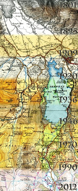
Over the two hundred or so years since the Ordnance Survey was set up there have been many changes to their mapping style: colour, lettering, the depiction of roads, vegetation etc. The Ordnance Survey Cartography Team recently put together this pretty image showing the evolution of maps through the ages.
It was produced by Cartographer Alicja Karpinska, who chose a slice of the Lake District after searching through archives to identify an area with a variety of different physical features that would perfectly show the two centuries of gradual development.
She used a number of maps from old school 1-inch-to-1-mile sheets dating from as far back as 1801 to today's 1:50000 Landranger Map.
The image was created by scanning the maps and then using Photoshop to seamlessly blend nine into one. Alicja left the original colours on the mapping extracts to most clearly illustrate the changes that have taken place.
So which is the best vintage?

Comments