
This topic has been archived, and won't accept reply postings.
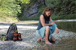
I saw this photo last night:
http://www.nationalgeographicexpeditions.com/assets/images/5829/itinerary-h...
Does anyone think there's something not quite right about it?
http://www.nationalgeographicexpeditions.com/assets/images/5829/itinerary-h...
Does anyone think there's something not quite right about it?
2
6
In reply to mypyrex:
To me the people look like they've been added into the picture. The lady in front looks like she is being illuminated from her front, having a light shone at her, from the opposite direction to which the sun is coming from. I'd hesitate to put money on it, but it generally has a 'photoshopped feel' to me.
To me the people look like they've been added into the picture. The lady in front looks like she is being illuminated from her front, having a light shone at her, from the opposite direction to which the sun is coming from. I'd hesitate to put money on it, but it generally has a 'photoshopped feel' to me.
Post edited at 13:06
10
In reply to mypyrex:
No, sorry. Bootlace undone?
> Does anyone think there's something not quite right about it?
No, sorry. Bootlace undone?
3
1
In reply to Timmd:
Yes, that was my immediate thought. The lighting on them doesn't look natural and the shadow of the girl's left hand trekking pole does not tally with the shadows cast by the sun.
> To me the people look like they've been added into the picture.
Yes, that was my immediate thought. The lighting on them doesn't look natural and the shadow of the girl's left hand trekking pole does not tally with the shadows cast by the sun.
Post edited at 13:06
3
In reply to mypyrex:
Very bright fill-in flash has been used (as is often the case in professional advertising photos). Works OK for me.
Very bright fill-in flash has been used (as is often the case in professional advertising photos). Works OK for me.
19
In reply to Gordon Stainforth:
Interesting, what's the purpose?
> Very bright fill-in flash has been used (as is often the case in professional advertising photos). Works OK for me.
Interesting, what's the purpose?
3
In reply to mypyrex:
In a similar vein, here's an interesting one from last year's photography awards: https://www.ukclimbing.com/articles/page.php?id=9228#13
Thoughts on the back of a postcard...
In a similar vein, here's an interesting one from last year's photography awards: https://www.ukclimbing.com/articles/page.php?id=9228#13
Thoughts on the back of a postcard...
1
In reply to mypyrex:
It's a bit bland artistically but I don't see anything that jumps out as obviously artificial, that couldn't be explained as use of additional lighting.
It's a bit bland artistically but I don't see anything that jumps out as obviously artificial, that couldn't be explained as use of additional lighting.
1
In reply to Rob Greenwood - UKClimbing:
He does say he was using a strobe, which probably explains a lot of the weird lighting effects.
He does say he was using a strobe, which probably explains a lot of the weird lighting effects.
In reply to planetmarshall:
To me it looks like the sky has been cloned where the person was standing. There's the tell tale signs in/around where the clouds look a little 'grubby', plus a few artefacts (i.e. repetitions of features) - for instance the smiley face in the clouds that appears twice. Once you see this it is almost impossible to stop looking at it!
To me it looks like the sky has been cloned where the person was standing. There's the tell tale signs in/around where the clouds look a little 'grubby', plus a few artefacts (i.e. repetitions of features) - for instance the smiley face in the clouds that appears twice. Once you see this it is almost impossible to stop looking at it!
13
In reply to mypyrex:
If you look at where the shadows cast by the sun are lying, you see that they point roughly towards the location of the camera. This would mean that the front of the two models and especially their faces would naturally be in shadow - obviously not something you want for an advertising photo. The purpose of the fill flash is to get rid of this shadow and ensure the models' faces (and for advertising, clothes) are lit. The extra shadows you can see on the girl's hand will be cast by the fill flash.
I would agree that in this case the effect is a little stark - but I can't argue too much because my own skill with a flash is extremely limited.
> Interesting, what's the purpose?
If you look at where the shadows cast by the sun are lying, you see that they point roughly towards the location of the camera. This would mean that the front of the two models and especially their faces would naturally be in shadow - obviously not something you want for an advertising photo. The purpose of the fill flash is to get rid of this shadow and ensure the models' faces (and for advertising, clothes) are lit. The extra shadows you can see on the girl's hand will be cast by the fill flash.
I would agree that in this case the effect is a little stark - but I can't argue too much because my own skill with a flash is extremely limited.
4
In reply to Rob Greenwood - UKClimbing:
It still looks a lot more 'real' than this one. (Just because it's so gloriously bonkers.)
https://www.ukclimbing.com/articles/page.php?id=9228#5
It still looks a lot more 'real' than this one. (Just because it's so gloriously bonkers.)
https://www.ukclimbing.com/articles/page.php?id=9228#5
4
In reply to Rob Greenwood - UKClimbing:
Ah, I was looking for something more subtle to suggest that something had been added rather than removed! But yes, the cloning work is pretty bad - especially when a content-aware fill can do this kind of thing almost seamlessly. I might even have had a go at removing the shadow from the boulder.
> To me it looks like the sky has been cloned where the person was standing. There's the tell tale signs in/around where the clouds look a little 'grubby', plus a few artefacts (i.e. repetitions of features) - for instance the smiley face in the clouds that appears twice. Once you see this it is almost impossible to stop looking at it!
Ah, I was looking for something more subtle to suggest that something had been added rather than removed! But yes, the cloning work is pretty bad - especially when a content-aware fill can do this kind of thing almost seamlessly. I might even have had a go at removing the shadow from the boulder.
Post edited at 13:49
1
2
In reply to mypyrex:
Fill-in flash (or possibly a reflector given the location and strength of natural light?). It ofte adds a weird amount of separation between subject and background. If combined with some bokeh from a wide aperture you don't notice it as much. In the odd thing I've been involved with I've noticed a shift towards natural lighting where possible for outdoor fashion stuff - possibly because of this kind of 'uncanny valley' feel about artificial lighting in outdoor locations.
This was shot with the lens pointing pretty much towards sunset and a big strobe to fill in the shadows. A few years ago, in the Pass: https://www.flickr.com/photos/paganusimages/28857799476/in/datetaken-public...
In reply to Rob Greenwood - UKClimbing:
I never liked the look of that photo first time round, but now you've pointed out that smiley face it's even more disappointing!
> To me it looks like the sky has been cloned where the person was standing. There's the tell tale signs in/around where the clouds look a little 'grubby', plus a few artefacts (i.e. repetitions of features) - for instance the smiley face in the clouds that appears twice. Once you see this it is almost impossible to stop looking at it!
I never liked the look of that photo first time round, but now you've pointed out that smiley face it's even more disappointing!
4
In reply to deepsoup:
I completely disagree. I think that is a genuinely brilliant photo. I don't know if there is any artificial lighting, but, if so, since I can't tell if there is, I'll forgive it in this case.
The very best photos often look "out of this world", but aren't. The problem is pickling them out from the fakery!
> It still looks a lot more 'real' than this one. (Just because it's so gloriously bonkers.)
I completely disagree. I think that is a genuinely brilliant photo. I don't know if there is any artificial lighting, but, if so, since I can't tell if there is, I'll forgive it in this case.
The very best photos often look "out of this world", but aren't. The problem is pickling them out from the fakery!
Post edited at 16:12
4
1
In reply to Gordon Stainforth:
I agree...and on a rambling tangent I'd suggest that THIS is the thing which now looks amiss. Even just 15 years ago the majority of photographs like this that we might see online, would be professional marketing photos, set up with all the "right" gear - fill flash, reflectors etc.
The massive proliferation of digital cameras and easy upload capability, has got us all used to "existing light" photographs, including those where a bit of fill flash even from a small in-camera flash might have helped. This in parallel with the spread of the notion that anything that looks a little unnatural "must have been Photoshopped", has given rise to threads like this.
I don't see anything amiss in the picture but I can understand where people are coming from with it.
> Very bright fill-in flash has been used (as is often the case in professional advertising photos). Works OK for me.
I agree...and on a rambling tangent I'd suggest that THIS is the thing which now looks amiss. Even just 15 years ago the majority of photographs like this that we might see online, would be professional marketing photos, set up with all the "right" gear - fill flash, reflectors etc.
The massive proliferation of digital cameras and easy upload capability, has got us all used to "existing light" photographs, including those where a bit of fill flash even from a small in-camera flash might have helped. This in parallel with the spread of the notion that anything that looks a little unnatural "must have been Photoshopped", has given rise to threads like this.
I don't see anything amiss in the picture but I can understand where people are coming from with it.
1
In reply to kathrync:
There is also a bright spot on the girl's sun glasses from the flash. This to me points to the use of a remote flash (possibly with a big reflector) off to the right of the picture. It also produces the pole shadows on her coat. The people look to me as if they are static rather in in mid step.
There is also a bright spot on the girl's sun glasses from the flash. This to me points to the use of a remote flash (possibly with a big reflector) off to the right of the picture. It also produces the pole shadows on her coat. The people look to me as if they are static rather in in mid step.
Post edited at 16:39
2
In reply to Blue Straggler:
I understand the technicalities of what you and others say about fill flash. Maybe "Amiss" was the wrong word.
That apart the picture to me looks wrong because of the apparently unnatural lighting of the figures and the conflicting shadows. I would have thought that if the photo was being used commercially then the least that could have been done was for the incorrect shadows to have been edited out.
1
In reply to mypyrex:
Zooming-on on the photo to 300%, the person in the lime-coloured jacket has a long vertical shadow on the front/left side of her jacket that appears to be being cast by the pole in her left hand. Her upper right leg also has a shadow that appears to be being cast by her left (forward) leg. These both point to a light source on her left. But the shadows on the ground indicate that the light is coming from her right. So yes, presumably photoshopped.
Edit: Accordng to tineye its a stock photo from Getty Images. http://media.gettyimages.com/photos/woman-and-man-hiking-with-view-to-aigui...
Post edited at 16:29
4
In reply to Andy Johnson:
Yes, those were some of the points I noticed
> Zooming-on on the photo to 300%, the person in the lime-coloured jacket has a long vertical shadow on the front/left side of her jacket that appears to be being cast by the pole in her left hand. Her upper right leg also has a shadow that appears to be being cast by her left (forward) leg. These both point to a light source on her left. But the shadows on the ground indicate that the light is coming from her right. So yes, presumably photoshopped.
Yes, those were some of the points I noticed
In reply to Andy Johnson:
You're right about the direction of shadows. What I think is happening is that the sun is overhead to her right and the fill in is on the ground to her left. Hence two lots of shadows. So not photoshopped.
You're right about the direction of shadows. What I think is happening is that the sun is overhead to her right and the fill in is on the ground to her left. Hence two lots of shadows. So not photoshopped.
1
In reply to Andy Johnson:
Or just multiple light sources...
> These both point to a light source on her left. But the shadows on the ground indicate that the light is coming from her right. So yes, presumably photoshopped.
Or just multiple light sources...
4
In reply to mypyrex:
Fill in flash would explain the odd shadow from the girl’s ski pole but why is the shadow from her leg (going the other way) still so dense? Shouldn’t it be washed out?
The shadows from the left ridge aren’t that long implying the sun is roughly above, to the left and behind, which doesn’t match the leg shadow (plus where is her body shadow?).
The foreground rocks seem to have a shadow in line with the camera except the one left and below the tip of the pole.
In reply to flour:
I know next to nothing about pro photography, but wouldn't you need some pretty heavy kit to produce fill-in at such a distance on such a bright day? The metadata [*] in the image says "Woman and man hiking with view to Aiguilles du Chamonix, Aiguille du Midi and Mont Blanc, Montblanc range, Chamonix, Savoy, France", so presumably it was taken above Cham looking roughly SE. Is it practical to carry that kind of kit up there? Genuine question as I don't know the answer.
[*] http://fotoforensics.com/analysis.php?id=27a3a077a41b9b61548b180b16f95f8e66...
Post edited at 16:53
1
In reply to Andy Johnson:
It looks as if the main picture(with or without figures) is somewhere along the Grand Balcon Sud.
It looks as if the main picture(with or without figures) is somewhere along the Grand Balcon Sud.
2
In reply to mypyrex:
From the two set of shadows:
There is a off-camera flash to the right pointing at them at about 45 deg.
Sun is behind them to left at 45 deg.
From the two set of shadows:
There is a off-camera flash to the right pointing at them at about 45 deg.
Sun is behind them to left at 45 deg.
1
In reply to deepsoup:
Has the man been photoshopped into the image?
I can't quite put my finger on the location either.
Edit.
Gulp, that's a genuine image.
> It still looks a lot more 'real' than this one. (Just because it's so gloriously bonkers.)
Has the man been photoshopped into the image?
I can't quite put my finger on the location either.
Edit.
Gulp, that's a genuine image.
Post edited at 17:32
In reply to Andy Johnson:
I don't know anything about pro photography either! Blue Straggler's comments about our perception of photos ring true. I assume the fill in light source is just off picture and level with the girl so creating the leg shadow onto her right leg. It looks like tops of their heads are lit by the sun and the length of shadow of the ski poles are consistent with the leg shadows on the ground. The body shadows would then be in the area of raised ground to the side of the path.
I don't know anything about pro photography either! Blue Straggler's comments about our perception of photos ring true. I assume the fill in light source is just off picture and level with the girl so creating the leg shadow onto her right leg. It looks like tops of their heads are lit by the sun and the length of shadow of the ski poles are consistent with the leg shadows on the ground. The body shadows would then be in the area of raised ground to the side of the path.
1
In reply to mypyrex:
Obviously posed because they're pretending to ski without skis or even any snow!
Obviously posed because they're pretending to ski without skis or even any snow!
3
In reply to mypyrex:
Getty Images has at least three photos of this couple in the same area by the same photographer:
http://www.gettyimages.co.uk/detail/photo/woman-and-man-hiking-with-view-to...
http://www.gettyimages.co.uk/detail/photo/woman-and-man-hiking-and-enjoying...
http://www.gettyimages.co.uk/detail/photo/woman-and-man-hiking-with-view-to...
This now suggests to me that, unless someone is going to a lot of trouble, they weren't added to a pre-existing image after all. So the odd shadows are presumably from fill-in flash as others have suggested.
Post edited at 17:56
3
In reply to Andy Johnson:
The ladies hi-viz jacket seems to be picking up the filler flash creating that weird look.
The grass, sky and mountains all look adjusted, either that or some odd HDR stitching is being used however there is no tell-tell white halo around the foreground.
The ladies hi-viz jacket seems to be picking up the filler flash creating that weird look.
The grass, sky and mountains all look adjusted, either that or some odd HDR stitching is being used however there is no tell-tell white halo around the foreground.
1
In reply to mypyrex:
Also the picture in question seems to come up in rather low resolution on my laptop screen, I don't know it it is something to with being on a Mac (I doubt, it's just a straightforward jpg), but somehow I am not moved to study in detail. I am impressed with those who are bothering to note shadow anomalies. Frankly it is a bog standard "pro" stock photo (this was my guess before someone else unearthed the evidence backing that up) and I would never have given it a second glance. Good for you for noticing, but I stand by my earlier reply which echoed yet earlier responses - it is simple fill flash, there has been no obvious cloning etc, nothing fishy at all.
Also the picture in question seems to come up in rather low resolution on my laptop screen, I don't know it it is something to with being on a Mac (I doubt, it's just a straightforward jpg), but somehow I am not moved to study in detail. I am impressed with those who are bothering to note shadow anomalies. Frankly it is a bog standard "pro" stock photo (this was my guess before someone else unearthed the evidence backing that up) and I would never have given it a second glance. Good for you for noticing, but I stand by my earlier reply which echoed yet earlier responses - it is simple fill flash, there has been no obvious cloning etc, nothing fishy at all.
1
In reply to ChrisJD:
Agree with the strategy - but can't see the flash shadows ??
I reckon they"ve made the shot more striking by using zoom to bring the massif closer.
Agree with the strategy - but can't see the flash shadows ??
I reckon they"ve made the shot more striking by using zoom to bring the massif closer.
Post edited at 18:10
In reply to mypyrex:
Looks like fill-flash to me - as several others have said. It's likely that without this they'd be in rather strong shadow with distracting light and dark patches across the bodies. The photographer is likely using a strobe / flash without a reflector or umbrella which has made them even harsher (an umbrella would have made the light much more natural).
@Andy Johnson strobes at full power are surprisingly powerful - they're able to overpower the sun at full brightness and short distance. You can also focus them quite a bit which will make the illuminated area brighter.
In reply to mypyrex:
A reflector has been used held by someone else or stand mounted well to the side of the photographer to reduce shadow on the faces, evident from reflection in her sunglasses and shadow of pole on her jacket. I don't think its a strobe, more likely reflection of the sun. Also a crude attempt at a mask around their jackets to selectively brighten/saturate the colours.
All in al pretty crap really
Post edited at 18:14
In reply to mypyrex:
The foreground has been superimposed over the background. A common practice in some Walking mags I believe.
The foreground has been superimposed over the background. A common practice in some Walking mags I believe.
In reply to mypyrex:
Total tangent - there is something amiss in this photo that I took, and I wonder if anyone can explain it.
https://www.flickr.com/photos/blue-straggler/36896577573/in/album-721576867...
The thing that is amiss is not really to do with photography...
edit - forgot to post the link originally!
Total tangent - there is something amiss in this photo that I took, and I wonder if anyone can explain it.
https://www.flickr.com/photos/blue-straggler/36896577573/in/album-721576867...
The thing that is amiss is not really to do with photography...
edit - forgot to post the link originally!
Post edited at 18:17
In reply to arch:
That is possible but what makes you say that, about this pic in particular? I don't see any clear evidence for it, merely "suspicion and possibility". I know the background seems more "dull" than the foreground but there can be many reasons for that.
Check out the links in Andy Johnson's post.
I still think (nothing personal!) there has in general been a lot of "look at me! I am so clever and cynical! This is obviously Photoshopped" guff going on over the years, from people that don't understand various technical aspects of in-camera work.
2
In reply to richprideaux:
Looks like it was getting chilly.
> This was shot with the lens pointing pretty much towards sunset and a big strobe to fill in the shadows. A few years ago, in the Pass: https://www.flickr.com/photos/paganusimages/28857799476/in/datetaken-public...
Looks like it was getting chilly.
2
In reply to Blue Straggler:
If you mean the clock face, its purpose is apparently "to get Bolivians to treasure their heritage and show them that they could question established norms and think creatively"
http://www.bbc.co.uk/news/world-latin-america-28013157
If you mean the clock face, its purpose is apparently "to get Bolivians to treasure their heritage and show them that they could question established norms and think creatively"
http://www.bbc.co.uk/news/world-latin-america-28013157
Post edited at 18:34
In reply to Blue Straggler:
Just looks like two separate pictures pasted together to me. That's all.
.........And i'm sh1t photographer.
Just looks like two separate pictures pasted together to me. That's all.
.........And i'm sh1t photographer.
1
In reply to richprideaux:
What is causing the background ridges to have a sort of "dark halo"?
> This was shot with the lens pointing pretty much towards sunset and a big strobe to fill in the shadows. A few years ago, in the Pass: https://www.flickr.com/photos/paganusimages/28857799476/in/datetaken-public...
What is causing the background ridges to have a sort of "dark halo"?
In reply to Blue Straggler:
Just have, all three pictures have a distinct line across the picture. Just saying.
> Check out the links in Andy Johnson's post.
Just have, all three pictures have a distinct line across the picture. Just saying.
1
In reply to arch:
I am totally not taking the mickey but....isn't that the treeline?!
> Just have, all three pictures have a distinct line across the picture. Just saying.
I am totally not taking the mickey but....isn't that the treeline?!
In reply to arch:
> Just have, all three pictures have a distinct line across the picture. Just saying.
Chamonix valley pollution? In reply to Blue Straggler:
It’s called chromatic aberration, it’s either caused by the shot setup and how the light is not being picked up, a cheap lens, or a combination of the two made worse by fiddling in Lightroom or Photoshop later.
https://en.m.wikipedia.org/wiki/Chromatic_aberration
There is deliberate form of chromatic aberration known as Bokeh which is done for artistic effect.
https://en.m.wikipedia.org/wiki/Bokeh
1
In reply to Blue Straggler:
No.
Look at what/where they're standing (the foreground) Then there is the background, to me, there is a distinct "line" between the two. Where the lighter coloured grass finishes.
> I am totally not taking the mickey but....isn't that the treeline?!
No.
Look at what/where they're standing (the foreground) Then there is the background, to me, there is a distinct "line" between the two. Where the lighter coloured grass finishes.
In reply to arch:
Fair enough. I did look for that before posting but honestly didn't see it - and if it is that blatant along a straight line, wouldn't we see a crude halo around the people (someone earlier mentioned that that isn't there)?
Fair enough. I did look for that before posting but honestly didn't see it - and if it is that blatant along a straight line, wouldn't we see a crude halo around the people (someone earlier mentioned that that isn't there)?
In reply to mypyrex:
While we are playing, what's amiss about this?
https://www.flickr.com/photos/blue-straggler/8465241469/in/album-7215763274...
While we are playing, what's amiss about this?
https://www.flickr.com/photos/blue-straggler/8465241469/in/album-7215763274...
In reply to Blue Straggler:
Fair enough. I did look for that before posting but honestly didn't see it - and if it is that blatant along a straight line, wouldn't we see a crude halo around the people (someone earlier mentioned that that isn't there)?
Hard to tell one way or the other with such a low resolution, but there is something possibly wrong with the blokes right shoulder.
1
In reply to Blue Straggler:
Yes, maybe we should, I don't know, I'm not a very good photographer, know nothing about photoshop. Just looks like it could be two different pictures stitched together to me.
Yes, maybe we should, I don't know, I'm not a very good photographer, know nothing about photoshop. Just looks like it could be two different pictures stitched together to me.
In reply to mypyrex:
Spot on. I thought that her left hand and pole shadow were from a completely different lighting direction than the rest of the scene. Guy behind her seems not to have a similar shadow. Why not? Also both look posed.
Spot on. I thought that her left hand and pole shadow were from a completely different lighting direction than the rest of the scene. Guy behind her seems not to have a similar shadow. Why not? Also both look posed.
In reply to mypyrex:
The image perpetuates the impression that the outdoors is for middle class heteronormative white people!
The image perpetuates the impression that the outdoors is for middle class heteronormative white people!
2
3
In reply to Blue Straggler:
Probably an artifact of buggering around with clarity etc.
> What is causing the background ridges to have a sort of "dark halo"?
Probably an artifact of buggering around with clarity etc.
In reply to mypyrex:
This is probably a better example - 10 points if you can spot the very large cylindrical feature added in post-production...
https://www.instagram.com/p/BbBhymdhtSQ/
This is probably a better example - 10 points if you can spot the very large cylindrical feature added in post-production...
https://www.instagram.com/p/BbBhymdhtSQ/
In reply to Robert Durran:
You completely misunderstand - I think it's a genuinely brilliant photo too.
> I completely disagree. I think that is a genuinely brilliant photo.
You completely misunderstand - I think it's a genuinely brilliant photo too.
In reply to richprideaux:
Could you post the original shot for us so we can see any/the difference?
And what is this strobe you speak of?
> Probably an artifact of buggering around with clarity etc.
Could you post the original shot for us so we can see any/the difference?
And what is this strobe you speak of?
In reply to mypyrex:
Yes! She's got Jimmy Hill's chin.
> I saw this photo last night:
> Does anyone think there's something not quite right about it?
Yes! She's got Jimmy Hill's chin.
1
1
In reply to Andy Johnson:
Fancy that. I look like probably being completely wrong.
> Getty Images has at least three photos of this couple in the same area by the same photographer:
> ht tp://www.gettyimages.co.uk/detail/photo/woman-and-man-hiking-with-view-to-aiguilles-high-res-stock...
> ht tp://www.gettyimages.co.uk/detail/photo/woman-and-man-hiking-and-enjoying-the-view-high-res-stock-...
> ht tp://www.gettyimages.co.uk/detail/photo/woman-and-man-hiking-with-view-to-aiguille-high-res-stock-...
> This now suggests to me that, unless someone is going to a lot of trouble, they weren't added to a pre-existing image after all. So the odd shadows are presumably from fill-in flash as others have suggested.
Fancy that. I look like probably being completely wrong.
1
In reply to Blue Straggler:
While we are playing, what's amiss about this?
https://www.flickr.com/photos/blue-straggler/8465241469/in/album-7215763274...
I give up - what is it please?
PS Can someone remind me how you include the original post without copy & paste? Thanks.
While we are playing, what's amiss about this?
https://www.flickr.com/photos/blue-straggler/8465241469/in/album-7215763274...
I give up - what is it please?
PS Can someone remind me how you include the original post without copy & paste? Thanks.
Post edited at 16:05
In reply to keith-ratcliffe:
You hit the "Quote Original" button.
> PS Can someone remind me how you include the original post without copy & paste? Thanks.
You hit the "Quote Original" button.
1
1
1
In reply to Rob Greenwood - UKClimbing:
If you're dissing your own awards why miss the fake moon that won the previous year?
https://www.ukclimbing.com/articles/page.php?id=8178
If you're dissing your own awards why miss the fake moon that won the previous year?
https://www.ukclimbing.com/articles/page.php?id=8178
1
2
In reply to keith-ratcliffe:
As Chris answered, it is an infrared photograph, this is why the grass appears virtually white despite there (obviously?) being no snow on the ground. I guess one could suppose that it was a light frost and therefore nothing really “amiss” though.
Green foliage reflects a lot of infrared and thus appears bright in infrared photos
Dark clothing dye does the same, so black jumpers appear white!
In reply to Adam Long:
The Moon looks fine to me, it seems to be in the right phase to have risen shortly before sunset and it seems to be about the right place on the horizon relative to the setting sun. Are you sure it's fake - what am I missing?
The Moon looks fine to me, it seems to be in the right phase to have risen shortly before sunset and it seems to be about the right place on the horizon relative to the setting sun. Are you sure it's fake - what am I missing?
In reply to arch:
Exactly what I thought. The people look to be hiking along some Lakeland fell which has been slapped crudely into some greater range.
Exactly what I thought. The people look to be hiking along some Lakeland fell which has been slapped crudely into some greater range.
In reply to deepsoup:
He's referring to the size of it when shot with a 14mm lens (shot that wide and when part of such a large stitch it should be much smaller).
The moon is shot at 50mm to more accurately replicate the size it was when viewed in real life. You could also do it by warping the stitch.
With regards the other photo it's just an off camera flash, no huge conspiracy there. It's provided a bit too much separation for my tastes but then other people might like it.
4
1
In reply to James Rushforth:
Interesting. There is definitely a debate to be had regarding manipulation of images submitted for competitions, and it's down to the organisers to be explicit in what they allow. I recall the furore surround the (ex) winner of the LPOY winner in 2012: https://petapixel.com/2012/11/02/landscape-photographer-of-the-year-2012-st...
Interesting. There is definitely a debate to be had regarding manipulation of images submitted for competitions, and it's down to the organisers to be explicit in what they allow. I recall the furore surround the (ex) winner of the LPOY winner in 2012: https://petapixel.com/2012/11/02/landscape-photographer-of-the-year-2012-st...
In reply to Jon Read:
Yes of course. I've entered a lot of competitions: http://www.jamesrushforth.com/awards/ and you always have to submit all of your RAW files for the big ones, as well as stating exactly how you achieved the shot.
However I think 10 pages of T&C's for UKC is a little overkill. Tim Glasby is a professional photographer and knows his stuff. Personally I love the UKC galleries and find the website by far the toughest crowd when compared with pure photography sites. It's really quite interesting (and disheartening) to see photos that have gone straight to the top of 500px get hammered by the voters of UKC.
Whilst I'm getting sidetracked (and this isn't directed at you John) a little food for thought (as this is what I love about photography). If I shoot an insect at 600m at f/4 the background looks like nothing you'd ever see with your eyes. If I then shot the background at f/8 and merged the two to create a composite it would look more realistic, but it would also be a composite and have undergone more digital editing. Which is the purer image? The one that looks the most true to life, or the one that has undergone the least editing?
6
In reply to James Rushforth:
Is moving the moon allowed as well? I'm always finding that the moon rises at inconvenient times
> The moon is shot at 50mm to more accurately replicate the size it was when viewed in real life. You could also do it by warping the stitch.
Is moving the moon allowed as well? I'm always finding that the moon rises at inconvenient times
1
1
In reply to James Rushforth:
Totally agree, what is photography if not the attempt to capture a feeling of being in the presence of a subject, or what we 'see', using a particular medium? I 'm sorry if you thought i was being critical, that was the last thing in my mind. Your moon looked natural to me.
Totally agree, what is photography if not the attempt to capture a feeling of being in the presence of a subject, or what we 'see', using a particular medium? I 'm sorry if you thought i was being critical, that was the last thing in my mind. Your moon looked natural to me.
1
Not at all, sorry if I came across defensive. And Adam has a fair point (if expressed a little harshly). It's always good to reflect!
1
In reply to James Rushforth:
Yeah, he can talk with his fancy polarizers and tilted planes of focus ...
Yeah, he can talk with his fancy polarizers and tilted planes of focus ...
In reply to James Rushforth:
Skysafari, moving the moon, or both? Almost what I like most about taking photos is pouring over maps and sun and moon tables, and weather forecasts, working out when and where to be to get the sun or moon just where you want them. I'm afraid that, at least for me, just adding the moon where you want to afterwards is somewhat missing the point! A full moon rising between two particular snowcovered mountains lit by the setting sun might only happen once in years and it would seem a shame to fake it.
> I can't recommend it enough!
Skysafari, moving the moon, or both? Almost what I like most about taking photos is pouring over maps and sun and moon tables, and weather forecasts, working out when and where to be to get the sun or moon just where you want them. I'm afraid that, at least for me, just adding the moon where you want to afterwards is somewhat missing the point! A full moon rising between two particular snowcovered mountains lit by the setting sun might only happen once in years and it would seem a shame to fake it.
Post edited at 18:21
In reply to Robert Durran:
Can't tell if your comment is tongue in cheek or not. Of course the app! If you just banged a moon where you wanted there wouldn't be much need for it! Click the link, it saves the need for sun and moon tables (though obviously if you prefer them that's fine as well).
Can't tell if your comment is tongue in cheek or not. Of course the app! If you just banged a moon where you wanted there wouldn't be much need for it! Click the link, it saves the need for sun and moon tables (though obviously if you prefer them that's fine as well).
2
In reply to James Rushforth:
James, are you really saying the original moon in that shot was in the same position, just smaller? I can't work out how a moon at that phase would be in that position at sunset, but I haven't visited the location.
There was some debate on twitter about this shot at the time - from the information James gave this was my best guess at the size and position the moon of the moon (assuming it was captured on the same shoot):
https://pbs.twimg.com/media/Cb2S582W4AIwf-3.jpg
For reference, here's a shot of mine showing an undoctored moonrise. Focal length was about 80mm I think, though it was on slide so no exif:
https://www.ukhillwalking.com/images/dbpage.php?id=81848
Post edited at 10:19
In reply to Adam Long:
That Twitter photo looks completely wrong to me, especially compared to your photo. Yours is a half-moon whereas his is waxing gibbous, a few days closer to full than yours.
Over flat land, you'd expect a half-moon to be rising at noon and a full moon to rise at sunset. So a half-moon would be at its highest at sunset, and a gibbous moon closer to the Eastern horizon. A full moon rises as the sun sets.
The shadows suggest the sun is in roughly the same position relative to the camera, close to the horizon out of shot on the right, in both photos. So a fuller moon should have risen more recently and be closer to the horizon towards the left of the picture shouldn't it?
The Twitter photo shows a gibbous moon much further along than your Froggatt half moon (which is a lovely picture btw); in that position relative to the Sun it should be waxing crescent.
> For reference, here's a shot of mine showing an undoctored moonrise. Focal length was about 80mm I think, though it was on slide so no exif:
That Twitter photo looks completely wrong to me, especially compared to your photo. Yours is a half-moon whereas his is waxing gibbous, a few days closer to full than yours.
Over flat land, you'd expect a half-moon to be rising at noon and a full moon to rise at sunset. So a half-moon would be at its highest at sunset, and a gibbous moon closer to the Eastern horizon. A full moon rises as the sun sets.
The shadows suggest the sun is in roughly the same position relative to the camera, close to the horizon out of shot on the right, in both photos. So a fuller moon should have risen more recently and be closer to the horizon towards the left of the picture shouldn't it?
The Twitter photo shows a gibbous moon much further along than your Froggatt half moon (which is a lovely picture btw); in that position relative to the Sun it should be waxing crescent.
In reply to deepsoup:
Yeah, it's a guess - agree with what you've said. What is a big confounder in this one is the enormous field of view in James' pic (which my shot would be a tiny section of) making it hard to compare angles.
Yes, the angle is fairly constant with phase but of course there is a lot of variation in height over the year and 52 year cycle. My Froggatt shot has the moon unusually low in the sky for the phase and season. Pure luck - it rose after I'd set the tripod up - but it did switch me on to tracking the moon's behaviour more.
It's a while since I did that twitter shot but I used the rough date info given - I think it was near the summer solstice - then found nearest date with that phase, and then used the Photographer's ephemeris app to give azimuth etc. So the moon's position is actually correct for that phase on the date I chose, but I had to guess the date, in particular the year!!
Edit: here you go, have a play around with some dates, I can't get much different:
http://app.photoephemeris.com/?ll=46.624455,12.292125¢er=46.6205,12.2953&d...
Post edited at 11:37
In reply to Adam Long:
I already had a little play with Stellarium (open source virtual planetarium thingy - it's really rather good).
Starting at the Summer solstice of 2015, and moving on until the Moon was at about the right phase, I ended up settling at 6.30pm, 27 June 2015
Here are a couple of screenshots:
http://www.deepsoup.f2s.com/UKC/Screenshot_20180109_111100.png
http://www.deepsoup.f2s.com/UKC/Screenshot_20180109_111132.png
Thanks, I'll have a play around with that a bit later on.
(This is a displacement activity and once again UKC has taken up a lot of time I should be using to do much less interesting things, so I'll have to leave it for now... )
I already had a little play with Stellarium (open source virtual planetarium thingy - it's really rather good).
Starting at the Summer solstice of 2015, and moving on until the Moon was at about the right phase, I ended up settling at 6.30pm, 27 June 2015
Here are a couple of screenshots:
http://www.deepsoup.f2s.com/UKC/Screenshot_20180109_111100.png
http://www.deepsoup.f2s.com/UKC/Screenshot_20180109_111132.png
> Edit: here you go, have a play around with some dates, I can't get much different:
> http://app.photoephemeris.com/?ll=46.624455,12.292125¢er=46.6205,12.2953&a...
> http://app.photoephemeris.com/?ll=46.624455,12.292125¢er=46.6205,12.2953&a...
Thanks, I'll have a play around with that a bit later on.
(This is a displacement activity and once again UKC has taken up a lot of time I should be using to do much less interesting things, so I'll have to leave it for now... )
In reply to deepsoup:
Ha, ditto!
Looks like your screenshots are a bit earlier in the day - sunset looks more like 9pm at the solstice.
Just noticed the same shot is on the cover of the Dolomites guide with no moon at all, so maybe it wasn't there at all...
> (This is a displacement activity and once again UKC has taken up a lot of time I should be using to do much less interesting things, so I'll have to leave it for now... )
Ha, ditto!
Looks like your screenshots are a bit earlier in the day - sunset looks more like 9pm at the solstice.
Just noticed the same shot is on the cover of the Dolomites guide with no moon at all, so maybe it wasn't there at all...
In reply to Adam Long:
Wow, flattering how much thought has gone into this.
It was a huge stitch, taken on a wide angle lens (stitched cylindrically if memory serves correctly) a long time ago. It's been warped back into a sensible shape and it's a composite. I stated this on the photo. If you go to page 299 of my recent guidebook 'Photographing the Dolomites' it's also stated quite clearly in the caption there. The photo has not been used in any major competitions as I didn't put it forward for the awards on UKC, it was uploaded to the galleries and I even added a description of how it was achieved.
The photo was used on the front cover of the Dolomites guidebook with the moon removed for obvious layout reasons.
The photo is a near as dammit to the scene, obviously it's not completely accurate for the above reasons. It took a lot of effort and it was a genuinely beautiful sight to witness.
I'll tag out here as there's definitely a little unnecessary spite, I wish you all the luck in the world with your photography career!
4
In reply to James Rushforth:
James, apologies if you're offended. No spite intended - it's a great shot and has obviously been successful for you. For me the moon is obviously unreal in this shot but you've clearly judged it well as no one else seems to notice. Maybe fake was a strong word to use but I'm a bit of a geek when it come to photographing the moon, and being bored at work trying to reverse engineer the reality is a fun diversion. If you could tell us the date it was taken that would be the end of any debate.
James, apologies if you're offended. No spite intended - it's a great shot and has obviously been successful for you. For me the moon is obviously unreal in this shot but you've clearly judged it well as no one else seems to notice. Maybe fake was a strong word to use but I'm a bit of a geek when it come to photographing the moon, and being bored at work trying to reverse engineer the reality is a fun diversion. If you could tell us the date it was taken that would be the end of any debate.
This topic has been archived, and won't accept reply postings.

Elsewhere on the site


Loading Notifications...