


© Sean Kelly, Feb 1991
Sean Kelly is a keen climbing and mountain photographer. His photos have appeared in several climbing guidebooks, and he has a stunning gallery on UKC.
In this technical article, Sean takes us through different techniques of photo manipulation using Adobe Photoshop.
If you want to read Sean's more general tips on photography, composition etc, then read his earlier article here: UKC Article.
DIGITAL CAMERA WORKFLOW TECHNIQUES with PHOTOSHOP CS1/2/3/4
This article is primarily concerned with the techniques and processes necessary to generate a satisfactory photographic result via the medium of Adobe Photoshop.
Much of what is detailed below can also be done in Elements & Lightroom, and even Paint Shop Pro has a Layers facility but works in a slightly different way to Adobe software. I am assuming that most accessing this article will be working via the medium of Windows so those with Apple computers will hopefully understand that keystroke instructions will differ for Mac users. For those not concerned with this degree of input and learning, alternative simpler one-click-fix software should suffice (for e.g. Gimp, Picassa, Paint etc). With Photoshop this is a truly vast subject and no doubt intimidating to newcomers as well as to some seasoned professionals, (I will be working with CS3 but a lot of this applies to other versions of PS). There is no one way for achieving a particular result and you will encounter many different ways to make, for example, a Black & White conversion. I personally know of about 6 different methods. The same also applies to Sharpening. So at the end of the day personal choice will decide. In other words, what works best for you? Remember there are numerous books out there as well as the 'Web' to help progress towards a fuller understanding of Digital Camera Workflow (Links included at end of article).
Basic Workflow
Capture of J-Peg/RAW filesBacking-up filesPartial/full conversion of downloaded files by Adobe Camera RAW Cropping, Resizing & ResolutionExposure control & Dynamic Range (using Levels & Curves)Colour Management (removing Colour casts, Saturation etc.) Selection issues (working on only part of an image)Replacing the Sky / Distortion techniquesRetouching & repairing the image (removing telephone lines, dust, pylons etc)Black & White conversion / partial B&W conversion / Sepia toningSharpening techniques (RAW sharpening, Smart Sharpen, Unsharp Mask)Panoramas Soft focus effectsHDR (High Dynamic Range)Resolution / Re-sizing the image / Saving the imageLinks & further reading
To assist working in Photoshop it makes sense to Copy & Paste the relevant section into WORD and printing out a copy to follow so that it will be easy to 'dive' into any particular technique. I readily understand that what everyone new to a topic wants to do is be led by the hand initially, before venturing into unknown waters and experimenting for themselves.
Capture & Conversion of J-Peg/RAW filesAdobe Bridge
For this section we will be using Adobe Bridge and Adobe Camera RAW (ACR) from CS3 Extended. Both these programs come included with Photoshop CS and CS 2/3/4. Some alternatives to these programs include Breeze Browser and Capture One, and Nikon have NX Capture.When a Memory Card i.e. CF or SD, or a Camera is detected, and Adobe Bridge is the default setting, it will automatically launch the Adobe Bridge Photo Downloader. Click on Browse and locate the desired destination folder for your files. If creating a sub-folder using a date, annotate yyyy/mm/dd, and/or name the files in the custom Name box (don't forget to cancel any previous file name). Un-tick any pictures that you don't want downloaded, then click 'Get Photos'. With large (12MP+) RAW files & big Memory Cards this can take some time, so go for a cup of tea.

When all the selected photos have finished downloading, a new window will open in Adobe Bridge. Adobe Bridge is a Browser program that basically just organizes and finds your files. It replaces the old Contact Sheet. Now is a good time to rotate any files that are exposed in portrait format, using the 2 arrows top right. It may be necessary to click the appropriate file in the Folders pane (top left). To access Filmstrip Focus mode, either click the Window menu, Workspace, Filmstrip Focus, or keystroke Ctrl+F5. Select the photo you want to enhance and double-click, and it will open in Adobe RAW (ADR). If the photo has been shot in J-peg format then the standardPhotoshop window will open.

BACK-UP, BACK-UP, BACK-UP...THIS IS VITALLY IMPORTANT!
Before doing anything else, when satisfied that all photos has transferred successfully to the correct folder on your hard drive, make a copy onto either a separate storage device or CD/DVD data disc. Check that it has copied correctly before re-formatting the Memory card. Only then it is also OK to proceed.
At this stage make a contact sheet and/or proceed to processing files. Click File > Automate > Contact Sheet.
Conversion of RAW files
RAW is a format that some digital cameras can use to save images as opposed to JPEG or TIFF. Raw is a digital negative and no information has been discarded in the image capture process by the camera. If your camera doesn't support RAW, move on to the next section. TheAdjustments pane is where you'll do most of your work in RAW. We'll start with the Histogram at the top

The Histogram is a visual representation of the data that composes your image. The first thing to learn is that the left side represents darkness, and the right side, brightness. This one is pretty well-balanced - we can see that there's a pretty decent amount of "dark" in it, mostly coming from the dark foreground. The Histogram is useful for telling you at a glance if there's a problem with the image - if you see a big spike over on the right side, you know that there might be a highlight "clipping" where part of the sky is so bright, the camera was overwhelmed, and there's no detail there anymore, so I shall crop this area out (click the purple arrow top R, to see clipped areas). Alternatively, if it looks "scrunched" all the way to the left, there might not be enough light in the scene. Keep this in mind the next time you're shooting - once you get used to looking at the Histogram, it can help you a lot when you're reviewing an image. Next we have the actual adjustments. This is where the real power of Adobe Camera RAW (ACR) comes into play.
White Balance is the first adjustment that is performed, indeed it may be the only adjustment that need be carried out in RAW. Digital cameras have to try to detect what the colour "white" is in an image. Sometimes, they do a good job of it, especially in easy situations such as outdoors in brightly lit sunlight, like this image. Others, such as a room with mixed types of lighting, might "fool" the camera, and you'll end up with an image that has a coloured tint to it that's undesirable. You have two options here - you can either select one of the "presets" from the dropdown menu, or you can manually tweak the "Temperature" and "Tint" of the image. The Colour Balance is defined in °Kelvin, with midday light calibrated at 6500° First check that Daylight (from the dropdown list), or whatever the light source was, looked OK. Usually this is sufficient to solve most colour balance problems. It is possible to do this in Photoshop as an adjustment layer, but can more troublesome and fiddly.

Exposure sets the white point of your image. While it affects the overall brightness of your entire image, it is meant to affect the highlights (bright parts) of your image primarily. You can use the Exposure tool to try to bring back detail in highlights that are blown out (over-exposed). If you drag it to the right, it will raise the level of the highlights. If you drag it to the left, it will lower that level.
Recovery is the opposite of Exposure - it's meant to affect the shadows (dark parts) of your image, also known as the black point. If there are areas that are too dark and you can't see details you think should be there, do the same as with the Exposure slider - slide it to the right to bring the levels up, slide it to the left to bring them down
Brightness affects the midrange of your image - also known as the grey point. After you have set your white point and black point with the Exposure and Shadows sliders, you can use the Brightness slider to adjust the brightness of the overall image.
Contrast and Saturation are best controlled in Photoshop.
Chromatic Aberration canbe a problem with modern SLR's fitted with zoom lenses (especially if shooting with large apertures), where colour fringing i.e. blue or red, is evident at the edge of objects such as cliff edges and clothing against a plain background (such as skies). Click the 'Lens' icon, 3rd from R towards the top R of the workface, to reveal new tools. Move one of the sliders and note how this affects the fringing. Moving one slider is usually all that is necessary.
Batch Conversion of Raw files to J-pegs may be required for non-photographers to view on their PC's and is easily achieved in PS. If the required photos are not all in one folder, create a new temporary folder on your desktop (R. click > new > folder) and copy them into this new folder. This can be deleted later. Open the required photos inBridge holding down Ctrl as you make the selection, or select the first and last in a selected sequence while holding down Shift. Now go to Tools > Photoshop >Image Processor to reveal a new workface, and follow the obvious workflow. Select J-peg, and set Quality to 10 (a lower setting degrades the image). Be sure to remember the Destination folder where the J-pegs will be located. Tick the resize box and enter the required size if desired. Now go for a cup of tea.
Rotation & Cropping of the imageIf not performed in Bridge, then click Image > Rotate Canvas, select the appropriate setting. It is appropriate now to check that any visible horizon, or stretch of water, is level.

Fixing a Tilted Horizon
Instead of rotating the whole image 90° a partial tilting is required to level the horizon. This is Arbitrary rotation, and Photoshop has an ingenious tool to do this. Click & hold the Eyedropper tool to reveal the Measure tool, now click and draw a line across some element in the photo that should be level. Now go to Image > Rotate Canvas > Arbitrary and Photoshop has automatically noted the correct angle of rotation as well as if it should be clockwise/counter clockwise. Just click OK and the problem is solved. If this doesn't work, then it is a matter of trial and error to guess the degree of rotation required.Cropping Only 'Crop' to improve the composition or remove unwanted distractions in the background. An initial crop is made just before the camera shutter was released. To Crop, click the crop tool on the toolbar, and drag over the part of the image to be retained. The cropped area is greyed out. The crop can be adjusted by clicking and dragging the handles, then press Enter. To size the new image to the workspace click the Zoom Tool and clickFit Screen at the top of the window. The Zoom tool can also draw a rectangle to Zoom-in to check focus, or perform close detail work on the image.

Layers are what make Photoshop unique. Think of it as the layers within a cake. The chocolate on top, then sponge, a cream layer then sponge again. With Photoshop there is a Tone layer (Levels), Contrast (Curves), andcolour manipulation via Saturation & Colour Balance etc. And each of these Layers can be manipulated separately to a very fine degree (1-99), and in different modes. This is best achieved via Adjustment Layers. It is this infinite degree of manipulation that makes Layers so flexible. The Layers feature is the single most important part of Photoshop.
Exposure control of Dynamic Range using Levels & Curves
Levels
Go to the Levels adjustment either by clicking Image > Adjustments > Levels or simply Ctrl + L. Or even better, click Layers > Adjustment Layer > Levels. This makes a separate layer mask so the original image does not have any destructive manipulation. You will see a Histogram, a graph charting the relative amounts of light and dark in your image (White to the R, Black to the L). In the image below, note that theHistogram doesn't make it all the way to the right. Click and drag the little White slider on the far right of the histogram to the left, just enough to meet the rightmost edge of the histogram. The Black slider doesn't need any adjustment as pixels are right up to the edge of the Histogram. Now both the W & B points have been set. The middle slider determines the general brightness/darkness within the image. Auto rarely results in a satisfactory solution. As you drag the sliders make sure Preview is checked and you can see what you're doing. Hit OK and you're done! If colour is adversely affected by such manipulation, change from Normal to Luminosity in the Blending Modes box.


Curves are where real tone manipulation can be executed because of the degree of control it imparts. The workface consists of a box with a Grid and Histogram + a diagonal line which is manipulated to change both Tone and Colour within an image. Click to fix a point on the curve. A good place to start is the very centre, which has a value of 128 i.e. half-way between 256, the full range of tones. Experiment with moving the slider up & down, and L & R. One effects Contrast within the image, and the other the Brightness. Check out the presets in the top box to see the effect on both the shape of the Curve and the Colour and Tonality of the open image. Generally less is better than more. Aim for an 'S' shaped curve which creates an image with more snap. To return to the original image, click on the Custom tag in the box above. As with Levels, if colour is adversely affected by such manipulation, change fromNormal to Luminosity in the Blending Modes box.
- More information about Curves can be found here
Dodging and Burning
Avoid using the Dodge and Burn tools if possible! Instead, use any of the selection tools to define the area you want to burn or dodge and then apply Levels as above to lighten or darken that area. If you feel that you must use the Dodge and Burn tools then proceed very carefully, as detailed below.Feather the selection Select > Feather) so that you don't have obvious hard edges to the altered area. Try aFeather value of 2 to 10 pixels for the manipulation of a precisely defined area, and select 100 to 250 pixels feathering for a general adjustment to a non-specific broad area. Of course these values depend on the pixel size of your image and art. I always have my rulers set to read in pixels and eyeball what the feather should be. After adjustment use the History tool to 'undo' to compare the results. Drag the History state to the Delete bin, then Edit > Undo delete States, (Crtl-Z) to return.
Colour Management & Adjustment Colour management starts with the camera that acquires the photographic image, and getting what comes out of the inkjet matching what is viewed on screen. The default setting if you capture either J-peg or Raw/J-peg, is sRGB.If shooting only Raw it doesn't matter at this stage. This is the world standard for digital images, printing and the Internet. However some experts (Scott Kelby) advocate AdobeRGB1998. Apparently sRGB is best for Web output, and AdobeRGB1998 best suited to Inkjet output, as it offers a wider 'gamut' or range of colours. Be sure that PC and printer output are all calibrated for the same colour space whichever is more important. With colour adjustment there are two elements to consider, Colour Casts and Colour Adjustment/ Enhancement. More recent versions of Photoshop have a colour match tool for matching colours. It also has a trick "neutralize" option! This is the easiest way to get rid of a colour cast. It works with both RAW and J-pegs. Simply clickImage > Adjustments > Match Colour. Check the "Neutralize" option under Image Options and see what happens! Tick/un-tick the preview box to evaluate the outcome.

Alternatively try colour adjustment in RAW...

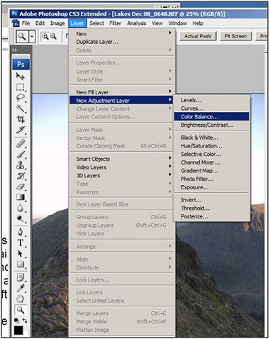
Colour adjustment in Raw starts with the drop-down menu (default is 'As shot'). It is a good idea to check what the image looks like when setting the light conditions pertaining at the time by clicking the appropriate tag. There are also a couple of sliders below (Vibrance & Saturation) offer further adjustment. Be aware that any contrast/Tonal changes can adversely affect the colour too. I prefer to manage any colour manipulation in Photoshop's Adjustment Layers, after checking the White Balance above. Colour adjustment in Photoshop is best achieved via Adjustment Layers. Click Layer > New Adjustment Layer > Colour Balance,clickOK,and the Colour Adjustment box is revealed.
Move the sliders until the correct effect is acquired. Snowscenes may need adjustment to remove excessive blue cast caused by UV radiation, picked up by the camera's sensor (but not the human eye!). Drag the Blue slider to the L, and possibly the Cyan slider R. Oscillate the Magenta/Green slider to correct for fluorescent light. Remember, less is best.

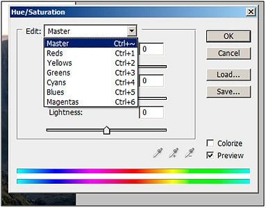
Further manipulation is available in Adjustment Layers via the Hue/Saturation menu (Layer > New Adjustment Layer > Hue/Saturation) that allows alternative methods for fine-tuning colour. Autumn colour can be accentuated by dragging the Saturation slider R after red has been selected from the drop-down box. Correspondingly, if all thee colours are tweaked together, skin tone need reducing by moving the red slider L. A very blue sky can be selected (use the Lasso tool) and feathered and then any excessive blue cast corrected.
Finally, in the Levels Palette at the bottom are located 3 eye-dropper tools, Black, White and Neutralgrey. Click on the Black tool (L) and then click on the darkest part of the image. Next, click on the White tool (R) and click on the brightest part of the image. This defines the Black and White points within the image, much as moving the Levels slider to the edge of the Histogram. The Grey eye-dropper tool (middle) is more problematic, as it is not so easy to locate a neutral grey point in the image and it usually takes a few goes until the right colour balance is attained.
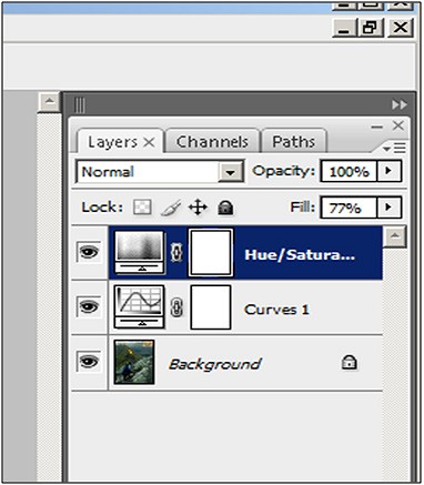
Adjustment Layers have the facility to manage the precise degree of adjustment utilizing either the Fill or Opacity sliders visible on the Adjustment Layers Palette. Check that the correct layer is selected, and as the slider is moved check the effect on the image visible in the Photoshop workspace.

Another
further refinement within Layers is Blending
Modes.
The default setting is Normal, but clicking on the drop-down menu
reveals further options. This essentially affects the Opacity of the
overlapping Layers and can be utilizes to create lots of striking
effects.
Blending
modes are grouped by type. The first group, starting with Darken,
all darken the layer. The second, starting with Lighten,
lighten the image. The third group, starting with Overlay,
add contrast. The fourth, starting with Difference,
compare and balance the layers. Think of the last group as modes that
"influence" the layer. Blending
Modes
are eminently suitable for special effects such as creating a
soft-focus image using Overlay
or Dissolve.
Selection
issues (working
on only part of an image)Sometimes,
only part of an image needs adjusting, such as a foreground that
lacks punch, as in the example above. Select the background in the
Layers palette (F7),
it turns blue, and make a selection using the 'Lasso' (L)
tool. Now feather the selection, (Selection
> Modify > Feather). Set value between 100-200 pixels for a large selection. Notice the
'creeping ants' when the selection is alive. An
adjustment using Curves (Layer
> Adjustment Layer > Curves) was
applied, then (Ctrl-D)
to deselect. Tryout the effects from the drop down box (Linear
Contrast is quite a gentle increase in contrast without effecting the
colour balance too much). The same process can be used to increase/
decrease the colour saturation (Layer
> Adjustment Layer > Hue/Saturation).
Remember that the exact degree of refinement can be controlled by
either the opacity/fill sliders in the Layers palette, or individual
colours selected within the Hue/Saturation
box.
i.e.
To increase the impact of Bracken in an Autumn photo, then drag the
Red slider R, likewise to decrease the colour in faces and skin, then
decrease the Red slider by dragging L. Increasing the yellow slider
helps give grass more impact.
For
more complex selections use the Quick
Selection tool (W),
new in Photoshop CS3, to quickly paint a selection using an
adjustable round brush tip. As you drag, the selection expands
outward and automatically finds and follows defined edges in the
image.
TheMagic
Wand tool (W)
lets you select an area by colour range without having to trace its
outline, (it can be especially effective with selecting skies). You
can specify the colour range, or tolerance,
for the Magic Wand tool's selection at tool's option bar. Enter a low
value to select a narrow range of colours very similar to the pixel
you click, or enter a higher value to select a broader range of
colours.
Replacing
a Sky
Sometimes
a reasonably good photo is ruined by a poor or non-existent sky. So
why not replace it? Initially, it is a good idea to develop the habit
of collecting relevant skies and copy them into a 'Skies'
folder, examples that have been captured at different times of the
day, year and weather conditions. Ideally, the selected sky should be
the same size and resolution, and any manipulation is carried out in
adjustments layers prior to selection. When
the sky is chosen, Make sure that the lighting shadows correspond
with the main photo, flatten any layers, then press (Ctrl-A)
and copy (Ctrl-C).
Open the photo that is to have the sky replaced and 'Paste'(Ctrl-V)
in
the new sky. It is important that the new sky is the bottom layer so
open the Layers'
palette (F7)
and double-click the background layer. In the box that appears
displaying a new name, layer
'0' click
OK.
The little Lock symbol vanishes when the Layer is unlocked. Hover the
cursor over the new 'sky' layer and drag it to the
bottom. An easier method is to have both images open and use the Move
to click and drag the new sky into the other photo.
Now
all that remains is to click on the original 'Background'
layer, and select the original sky (usually the 'Magic
Wand'
selection tool is sufficient to achieve this), feather the selection(Alt
> Ctrl > D)
by 1 pixel, then press 'Delete'.
It is a good idea to use the 'Zoom' tool (Z)
to check the detail in the selection and feathering before deleting.
The new sky is now revealed. If it needs to be adjusted, select the'Move'
tool (V)
and reposition the new sky until you are satisfied. Press (Shift
> Ctrl) to
save the photo as a new file. Select 'Tiff' so that it
doesn't degrade, and choose the appropriate folder location.
When done click Save
as and
rename.
Adding
drama to a sky
In
any photograph where the sky is dominant then the sense of drama can
be accentuated by this clever technique though purists might
disagree. Open the specific image for improvement, reduce in size
with the Magnifier
tool and using the Rectangular
Marquee (M)
tool draw a selection around the sky above the horizon, and hitCtrl+T.
A box is displayed around the selected area with handle to allow
distortion of the image. Hold down Ctrl
and
drag the handles top R & L out to the sides equally.
The
further the handles are dragged the greater the distortion, but
generally less is best. When satisfied with the result, press Enter.
The
photo now appears to have been taken with a camera fitted with a
Wide-angle lens. When the selection is made do not feather that
selection as it causes problems with a ghost image in the background.
Retouching
and repairing the image (using
the Healing & Clone tools)One
of the most annoying elements in a photograph is the telegraph pole
growing out of someone's head, or the litter in the foreground
that distracts our viewing and enjoyment of the image. Then again I
have a thing about climber's Crash Mats! There is a whole
arsenal of tools in Photoshop that will resolve these problems.
Different tools achieve different results and some are better at
certain tasks than others.
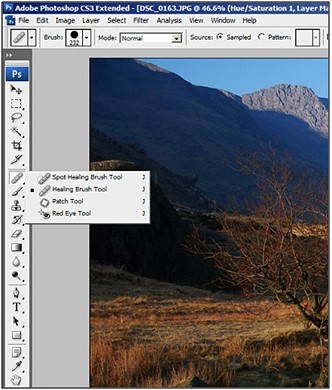
The
above photo is spoilt by the intrusion of telegraph poles and road
signs. First select the background layer in the Layers
window (F7), then press J
and select the Healing
Brush.
Set the correct Brush size (box top L), then holding down the Alt
key, click adjacent to the first telegraph pole to Clone, and now
click and hold the L mouse and drag the new selection along the
length of the area to be retouched. When the mouse is released the
repair is automatically realized.
Now
repeat the process for the other areas that remain to be retouched.
Problem areas in the sky such as telegraph wires, lens dirt, etc can
be more effectively accomplished by using the Spot
Healing
brush. But there is no need to select Alt first as with the Healing
brush, simply brush over the offending blemish.
When
any retouching is attempted, it is important to check closely, using
the Magnifying
Tool (Z) that the retouching has been effectively completed and
nothing has been missed.
If
a large area of the photo is to be retouched. Such as a sky, then thePatch Tool can be very effective. This is particularly so when creating a
Panorama when joins are sometimes noticeable in the sky. Be sure to
select the 'Source' box before selection of the Patch to
be copied, then selecting 'Destination' before dragging
and paste. Again be sure the Background layer is chosen beforehand.
Another way instead of using the Patch
tool makes use of the Copy
& Paste
feature found under Edit
menu.
Select the Rectangular
Marquee
tool and draw around a suitable area to clone from, then Copy
& Paste and
drag the patch to the area to be repaired. Then select the Healing
brush (Spot
Healing
brush is better for skies) and retouch the edges of the new patch.
Content Aware
The
latest version of Photoshop CS5 includes the Content Aware function
which removes a lot of the work involved in retouching. Ensure that
the Spot Healing Brush Tool and content Aware box are selected. Using
the Selection
Tool>
L or M, draw
around the part of the image to be cleaned, then Delete
& Enter.
That's
it! This will usually be sufficient to do a satisfactory job. The
Content Aware function is also good for cleaning up blank border
areas when stitching Panoramas. When each area is selected expand the
selection by 2 pixels then Delete
& Enter. Content
Aware will attempt, filling in the blank areas to match the rest of
the image. This action avoids having to crop an image too tightly.
It is also excellent for removing blemishes from skies especially
sensor dust. Holding down the Shift key as the selections are made,
means that the whole sky can be cleaned in one action.
Black and White conversion
Black
and White photography is a whole art-form all by itself. And indeed,
what may be an unimpressive colour photograph, can be transformed as
a B&W image, adding mood and drama. Originally all photography
was in B&W. Before Photoshop and Digital Photography, film
selection dictated this choice. Today however, unless the camera is
specifically set to B&W mode, then all B&W processing is
carried out post camera. Although there is a one-click option to
achieve a B&W conversion, this does not always result in an
evocative final image. Better to use a little more time and effort to
achieve a satisfactory final image.
Like
sharpening there is numerous ways in which this B&W conversion
can be achieved. The latter two probably accomplish the best results:
Convert
to Greyscale (Image
> Mode > Greyscale)
Desaturate
the colours (Image
> Adjustments > Desaturate)
Lab
mode (Image
> Mode > Lab Colour) Black
& White tool (Image
> Adjustments > Black & White)
Channel
mixer (Image
> Channel Mixer)
The Black & White Tool
Most
professionals formerly used the 'Channels palette' before the new B&W
Conversion tool available from CS3 onwards. So which is best? Well personal
preferences matter and what gives the required result will tend to be
favoured. Also to be considered is the degree of manipulation within
the B&W image, hence the total flexibility accessible within the
chosen adjustment technique. Further selective refinement is possible
using the Dodge
& Burn
tools.
Using
the Black & White tool
Go
to (Layer
> New Adjustment Layer > Black & White) to reveal the B&W tool palette. The original image is now displayed as a B&W photo. If the sliders are moved in the different Colour channels, the
effect is displayed. However, to acquire more flexibility, hold the
mouse over part of the image and drag it across the screen. This
darkens/lightens the colour channels in that part of the image, so
for example if the sky is selected and the mouse is dragged to the L
then it darkens and the whole image looks more dramatic. The opposite
applies if the mouse is dragged to the R. Further refinement can
still be made with the individual Colour Channel sliders. There are
also Custom Settings available from the drop-down menu. The Red or Yellow filter produces much more dramatic effects, in the same way as the
glass filter screwed onto the front of the camera lens. If Dodging &
Burning is contemplated, then a separate Duplicate
Layer is created and any adjustments applied to this layer, so that the
original image is not despoiled. When done click Save
as and
rename (best just to prefix B&W to the original file name).
Using the Channel Mixer
(Layer
> Adjustment Layer > Channel Mixer) In
B&W exposure of film where a yellow or red filter was placed in
front of the lens to produce dramatic skies, we're using a set
of red, green, and blue filters behind the lens. RGB files are
encoded as a series of pixels with a red, green, and blue component.
Photoshop represents these as Channels. Another advantage of
Channels is that the adjustment is carried out on an Adjustment Layer
so the original file is not directly changed.
This
explains why black and white film buffs used yellow/orange/red
filters. Look at the dramatic effect on the sky, especially useful
for landscape work. Contrast in the Orange channel is very good all
around, except that some detail is lost in the in the R hillside. The
green channel is more like what the scene looked like in real life,
and closest to the colour version of the photo, but the red/orange
are more dramatic.
In
most cameras, the green channel will be the cleanest - least noise -
because there are twice as many samples. The blue channel is usually
darker, because the colour filter itself is darker and blocks more
light. For the same reasons, there tends to be more noise in the blue
channel.
Like
its name implies, the Channel
Mixer
lets you adjust how much influence each channel has on the image. As
useful as the Channel Mixer is in colour photography, it's also the
ideal way to convert to black and white. It is also possible to
select one of the menus from the drop-down list, such as Infra-Red
and
preview the effect. Likewise another menu mimics the effect of using
an orange filter (to achieve more contrasty skies).
How
much of each channel to include is a matter of personal taste. When
the percentage from all three channels totals 100, the image will
match the brightness of the original,
you can make the frame brighter by exceeding 100 % or darker by
falling short.
How
to get Black and White photos with selective elements in colour
Select
the colour photo that is to be manipulated. Make sure it's in a
sensible colour format (Image, Mode, RGB colour). Duplicate the layer
(using the arrow in the top right of the layer panel). Make the top
layer invisible (click on the eye icon in the layer panel). Select
the bottom layer Image
> Adjustment > Desaturate (makes
it black and white). Select the top layer and make it visible again.
On
the toolbar, select the lasso tool. Draw around the area with the
lasso tool. If you want to be more precise, hold down the alt tab
while you are clicking. Now you should have a marquee round the area
you want to stay as coloured. Select
> modify > inverse makes
the marquee invert. Press the delete key, and the outside colour
should disappear, revealing your black and white photo underneath.
You can go around the completed colour image with the Eraser/Clone
tool to tidy up the image. Zoom in close to check the detail. When
done click Save
as and
rename.
Adding
Grain to Black & White images
Those
familiar with Kodak's Tri-X and Ilfords's HP5 will
remember the lovely grain that graced such images and even using
specialist developers to achieve such enhanced grain effects. Go to
Layer > New > Layer. Rename
the new layer from Layer 1 to Film Grain.
Fill the layer with 50% grey We'll
begin working on this layer by adding a 50% grey colour. To do this,
press Shift+Backspace or choose to Edit> Fill. Click on the Use
drop down menu, select 50% grey and click OK. The Film Grain layer
should now be filled with a 50% grey colour. Now
change the blending mode of the current layer to Overlay. Then
select Filter
> Artistic > Film Grain, and
adjust accordingly (be sure that the image is viewed full-size).
Now
any sharpening that is required can be undertaken.
Sepia toning
True Sepia
Toning began around the 1880s with photographic prints that were
exposed to sepia in order to aid in replacing the metallic silver in
the photo emulsion with a silver compound. Think of Victorio Sella
and the Abrahams. Later, Selenium toners were introduced. By doing so
the developer could change the colour, but more importantly increase
the rich tonal range of the photo. The technique of Sepia
Toning
was increasingly used for archival printing, by replacing the less
stable metallic silver. Now thanks to Photoshop no more yellow
fingers!
Start
with your colour image and select Image>
Adjustments> Desaturate. This brings us to a grey-scale version without having to convert, so
we can still add some colour. The next step is to apply Photoshop's
pre-packaged Sepia photo filter. You
do this by choosing Layer>
New Adjustment Layer> Photo Filter. This
will bring up the New
Layer
dialogue box.
Enter
the following settings:
Colour: None Mode: Normal Opacity: 100% Choose OK.
Now
you will see the Photo Filter dialogue box. Enter the following
settings: Filter: Sepia
Density: set
between 20-60% Preserve
Luminosity: Selected. Choose OK and you're done. If
the image lacks contrast, tweak the Contrast in Curves immediately
after the image has been de-saturated. When done click Save
as and
rename.
Sharpening Techniques
The
main issue to resolve is when to sharpen and by how much. In short,
the answer is determined by the use of the final output image (Print
or Web), the size of the image, the method employed, and if you
sharpen after all processing is completed. Personally I don't
perform any sharpening until I know where I am outputting the image.
So in effect I have 3 copies of the image.
The
RAW file that was exposed in the camera
The
full-size manipulated image saved as a Tiff/PSD file
The
final output image that may be either Tiff or J-peg depending on the
destination
It
is only at this final stage that any sharpening is applied.
Raw
images, by their very definition have had no sharpening preformed
in-camera as happens to images recorded in J-peg mode. So
consequently they look a little blurred. Prior to CS3 all sharpening
adjustment was either executed with the Unsharp-Mask filter or
Lab-Mode. Now we also have the Smart-sharpen filter.
Subsequent
to any sharpening, all Layers should be flattened (Layer
> Flatten Image) and the image resized to the final output requirement necessary.
Finally any image should be viewed at 100% (select the Zoom tool &
double-click on the open image).
Unsharp-Mask
(Filter
> Sharpen > Unsharp Mask) There
are 3 sliders in the box that appears, Amount, Radius &
Threshold.
Don't
hit either the Sharpen, Sharpen edges or Sharpen more, as there is
less control of the actions.
AMOUNT
sets
the amount of sharpening. A higher value increases the contrast
between edge pixels, giving the appearance of greater sharpness.
RADIUS
determines
the number of pixels surrounding the edge pixels affected by the
sharpening. The greater the radius value, the wider the edge effects
and the more obvious the sharpening. THRESHOLD
determines how different a pixel must be from the surrounding area,
before it's considered an edge pixel, and sharpening is
applied.
The
settings detailed below are not set in stone and it really is a case
of trial and error, and experience. Generally, what works for you is
what is right.
AMOUNT
% RADIUS
pixels THRESHOLD
levels Basic
Sharpening 125 1.0
3
Soft
subjects eg.
pet, flowers, etc 150 1 10 Portraits
eg.
close-up portraits 75 2 3 Moderate
sharpening eg.
home interiors, exteriors, landscape 225 0.5 0 Maximum
sharpening eg.
the photo is out of focus or the photo has lots of defined edges
like buildings 65 4 3 Web-sharpening depending
on the width of the web image 400-1500p 75-150 0.3-0.4
0
Sharpen using
Smart Sharpen
(Filter >
Sharpen > Smart Sharpen)
The
Smart Sharpen filter has sharpening controls not available with the
Unsharp Mask filter. You can set the sharpening algorithm or control
the amount of sharpening that occurs in shadow and highlight areas. Again zoom into the document window to 100% to get an accurate view
of the sharpening. Choose Filter >
Sharpen > Smart Sharpen.
Then set the controls in the Sharpen tabs.
Amount
Sets
the amount of sharpening. A higher value increases the contrast
between edge pixels, giving the appearance of greater sharpness.
Radius
Determines
the number of pixels surrounding the edge pixels affected by the
sharpening. The greater the radius value, the wider the edge effects
and the more obvious the sharpening.
Remove
Sets
the sharpening algorithm used to sharpen the image. Gaussian Blur is
the method used by the Unsharp Mask filter. Lens Blur detects the
edges and detail in an image, and provides finer sharpening of detail
and reduced sharpening halos. Motion Blur attempts to reduce the
effects of blur due to camera or subject movement. Set the Angle
control if you choose Motion Blur.
Angle
Sets
the direction of motion for the Motion Blur option of the Remove
control.
More
Accurate This
processes the file more slowly for a more accurate removal of
blurring. Adjust sharpening of dark and light areas using in the
Shadow and Highlight tabs. (Click the Advanced button to display the
tabs). If the dark or light sharpening halos appear too strong you
can reduce them with these controls, which are only available for
8 bits and 16 bits-per-channel images:
Fade
Amount Adjusts
the amount of sharpening in the highlights or shadows.
Tonal
Width Controls
the range of tones in the shadows or highlights that are modified.
Move the slider to the left or right to decrease or increase the
Tonal Width value. Smaller values restrict the adjustments to only
the darker regions for shadow correction and only the lighter regions
for highlight correction.
Radius
Controls
the size of the area around each pixel that is used to determine
whether a pixel is in the shadows or highlights. Moving the slider to
the left specifies a smaller area, and moving it to the right
specifies a larger area. Click OK.
Sharpening in RAW
In
CS3 open PS and then launch Bridge (File >
Browse
or Alt+Ctrl+O). Double-click on the selected RAW image and it
automatically launches the RAW workface. Be sure that you have the
latest RAW update so that the software is compatible with your
camera. If not, then download the relevant update from the Adobe
site. If you intend to do all processing in RAW such as Adobe Camera
Raw (ACR), it is not unlike using the Unsharp-Mask filter in
Photoshop. However, instead of the Threshold control, there are 2 new
sliders, Detail & Masking.
Before
you sharpen, again
make sure that you are zoomed in to at least 100%! Double click
on the magnifying glass at the top left corner for a quick 100%
zoom. You can see here that ACR automatically applies default
settings to every picture. (It is possible to change
these defaults by creating a new camera default). Don't
make any changes at this point if planning on further edits in
PS. Sharpening here and then sharpening again in PS often
creates too harsh an effect.
Amount – adjusts the level of sharpening
Radius – ACR sharpens the parts of your picture it thinks are edges.
This slider defines how wide an area must be for ACR to recognize it
as an edge. More is sharpened with an edge as the radius increases.
Detail – This slider helps control halos that sometimes appear around
parts of your image when sharpening. But if you go too low, no
sharpening at all will happen.
Masking – This slider is especially great for faces. It protects
non-edge areas from sharpening. The higher the number the more
is masked, and so less is sharpened.
These
adjustments are all dependent on each other. So increasing the
detail and masking at the same time might really help a portrait. Try holding the Alt key when adjusting Radius, Detail or
Masking. Your image will turn gray so that you can focus on each
change as you make it. When using this trick as you adjust the
Masking, remember that white means the effect is showing and black
represents areas where the sharpening effect is masked, or not
visible.
Special Effects
Panoramas
Initially
specialist stitching software such as Hugin was required to create Panoramas, but now Photoshop incorporates
software that does a very efficient job.
Shoot
raw mode whenever possible. Not only can you do the stitch before any
sharpening this way, but you can also ensure that you use the same
white balance when converting from raw. And as always, you don't
have any jpeg compression artefacts. Use a tripod if possible and
make sure it is level so any scan across will not tilt. Ideally there
is specialist tripod attachment that ensures that the camera only
rotates around the lens and not the camera-body, but if hand-holding,
then try to remember this. Make sure the camera exposure is in
manual mode and check the Histogram for possible blown highlights.
Don't use a Polarizer filter as it creates joining problems
especially with skies. Make sure your images overlap between 1/4 and
1/3.
Making
the stitch
Navigate
to File >
Browse
and open, and holding down the Ctrl key select required photos,
R-click and open in RAW. All the selected photos appear in the little
window to the L. again select, L-click Open Image and all the photos
will open in PS. Only the last photo appears open but the rest are
stacked underneath.
Now
click File >
Automate >
Photomerge.
When the box opens, then click Add
open files and
the selected files appear in the little window. Now decide which
Photomerge option to apply and click OK.
Usually Auto
works quite well, but if it is too distorted when the panorama is
revealed, cancel and try Cylindrical.
There is also the option of the manual stitch, Interactive
Layout
where there is total control of how the different images are coupled
together.
Once
the stitch has been completed it is best to flatten the different
layers, as the resulting file sizes can be enormous. 300mb is not
unusual for a stitch of 6/7 images from a 12 mp camera! It also makes
any further processing in PS more manageable unless lots of Gigabites
are available.
The
final step at the juncture is Cropping the Panorama to remove
unwanted areas and generally tidy the image. Any obvious areas of the
join that look imperfect or missing areas of sky can be repaired
using the Healing
and Clone
tools. When this has been completed the usual processing with Levels,
Colour Correction, Saturation and Curves
can be applied.
I've
used the clone tool to create more woods (R foreground) and enhance
the sky (top L) after problems revealed during the stitch and after
the final crop.
The
images obtainable from these techniques are truly stunning. The
Panorama above is 56 inches wide! In some ways the use of this
technique replaces the need for a wide angle lens. There are
viewpoints that do not allow the photographer to take a step
backwards to fit everything into the picture. This technique removes
the fear of backing over that cliff edge!
HDR (High Dynamic Range)
There
are lighting circumstances where the Dynamic Range can be seen by the
human eye, but not with the remit of the camera sensor. That is where HDR
applies. Open the images, either J-pegs or RAW. The camera should be
fixed on a tripod, exposures set to Aperture/Manual Exposure mode, to
ensure that the Aperture (F.stop) is unchanged, as it affects the
DoF. The 3 exposures are bracketed by either 1 & 2 full f.stops. White balance should be set to Daylight
for
consistency. The HDR feature in Photoshop is located by clickingFile >
Automate >
Merge
toHDR.
Click Add
Open Files and
hit OK.
Photoshop does the rest automatically, just follow the guide.
The
merged result is a floating-point 32 bit image. You can adjust the
overall tones by sliding the White Point slider. Easy with it, a
little movement goes a long way! Click OK
to merge the photos into a 32 bit image. Now is a good time to save
your file.
Choose Image >
Mode >
16
bit (or 8 bit).
Now we get to play with some fun options. You're now at the
tone mapping part of the process. You'll see an HDR Conversion
Dialog box. Exposure
and Gamma
are the default options. Set the Gamma
first, and then adjust exposure to suit. If you want an image with
lots of contrast, lower the Gamma.
For less contrast raise the gamma. Finally, adjust the exposure to
get the desired brightness. Press OK
to convert.
Tonal
Mapping.
A
more advanced method of realising HDR is achieved by
Tonal Mapping. Change
the
Method to
Local Adaptation. (There
are 4 available methods, but these are the only 2 with user input).
With Local
Adaptation,
you can adjust the curves. Set these like you would normally work in
curves, but don't be afraid to clip the Histogram a little. You
can clip because you're working with a larger dynamic range
than you're used to. Bring out the detail in the image, but
don't forget to put some shadow in there or it will look washed
out and fake. Once you're happy with the curve, adjust the Radius
and Threshold
sliders to make sure there are no halos in the photo. (Badly
converted HDR images have a glow around the areas of contrast). The
Radius
controls the Mask Blur while the Threshold decides what gets blurred and what doesn't. Click OK
to convert. If a more surreal effect is desired, there are different
plug-ins that you can use.
Try
the free trial download Photomatix Pro
from HDRsoft
from http://www.hdrsoft.com/download/pluginwin.html.
You can just get the tone mapping plug in for Photoshop which works
great. Using Photomatix
Tone Mapping plug-in allows you to get highly detailed textures in
your photographs. You merge in Photoshop as shown in this tutorial.
Then choose Filter >
Photomatix
to apply tone mapping. Convert and save as normal.
Finally
it should be noted that HDR cannot be really appreciated on a
computer screen nor ink-jet printers do justice to the technique. An
alternative option is to process the 3 images separately in Photoshop
and create individual layer masks to reveal the best aspects of each
image when pasted on top of each other.
Soft focus effects
Again
this is achieved in Layers. Go toLayer >
Duplicate
Layer,
press F7 to reveal the Layers palette and note the new duplicate
layer. Double-click the Background
Layer and
rename 'layer 0' then drag the blue highlighted Background
Layer above
the Duplicate
Layer.
Click the Duplicate
Layer
to highlight it, and go to Filter >
Blur >
Gausian
Blurand
set between 6 & 12. Set the Opacity to 50%. Go to Layer >
Adjustment
Layer >
Hue/Saturationand
drag the slider to increase the saturation. Un-tick Layer
'0'
to reveal the Duplicate
Layer
beneath. Re-tick again and select the eraser tool set to a low value,
and brush over the areas that you want revealed more clearly.
Gradually the soft rich colour of the base layer is revealed. Save to
file when satisfied with the effect. Preserve the layers so if
further adjustment is required then open the image again and click on
the Saturation/Levels
or other layer to modify previous adjustments. It is also possible to
select one of the Blending
Modes
and experiment with the different effects. Have fun!
Creating a multi-image photograph
This
works best when the initial images are shot with the camera mounted
on a tripod. It makes fitting the image together much easier although
it is still possible when the camera is hand-held. Fire off half a
dozen or so exposures of the subject, best using a manual exposure
setting and try to keep the lighting uniform. A bright sunny day is
best. Open all the images in Photoshop and decide which will be theBackground
Layer. Then
after selecting the Rectangular
Marquee
tool, highlight the 2nd
image by clicking on it and draw a selection around the figure, but
not too close. Leave a little space so the image can be feathered(Selection
> Modify > Feather)
by about 25 pixels, then Copy
(Ctrl+C) onto the Background
Layer. Continue
to repeat this procedure until all the images have been pasted onto
the Background
Layer.
Go
to the Layers
Palette
and un-tick all but the first image to be blended. The new layer is
shown as Layer
1
in the Layers Palette. Use the Move
tool to reposition if necessary and clean up any blemishes with theEraser
tool. Carry on with Copy
& Paste until
each image has been copied onto the Background
Layer. Tick
and un-tick in the Layer Palette to check progress, until all images
have been re-positioned, and cleaned up with the Background
Eraser
tool.
When
finished, un-tick all in the Layers Palette to view the completed
merge. Flatten all layers when satisfied, and make any final
tonal/colour adjustments.
Resolution, Re-sizing and Saving
Pixel
stands for PICtureELement.
There are 3 aspects to Digital Resolution, CAMERA, and SCREEN &
PRINT
Camera resolution
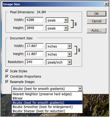
My Nikon camera has a Resolution of 12.3mp i.e. each image is
recorded as 4288px x 2848px to produce a 12.21mp output. That's
14.29"x9.49"@300dpi or 17.9"x11.9"@240dpi.
The bigger the captured image size, the larger the print that can be
obtained. A Hasselblad has a 45mp image output!
However,
resolution of the image is also affected by the size and quality of
the camera sensor so that more MP does not always equate to
better/larger images. The sensors are smaller on the point &
shoot Compact camera. Digital SLR's are either Full-frame (the
old 35mm format) or DX format (1.5 or 1.6 ratio). Likewise the
film-sensor may be the latest CMOS type, found only on prosumers
cameras. In short, the more expensive the camera, the more
resolution!
Resolutionfor
Screen
Think in pixel
dimensions.
Images being prepared for viewing on a screen are measured in pixels,
not in inches. My
computer monitor is 20-inch. That is 1680px 1050px (1.75 million
pixels) and are viewed at 72 px per inch. Therefore any pictures for
the web need to address this fact. Laptop monitors are often smaller,
so images will tend to partially disappear off the screen if not
resized.
Image
Resolution for Print signifies
how many of your image's pixels will fit inside each inch of paper
when printed. Obviously, since your photo has a fixed number of
pixels, the more of them you squeeze inside each inch of paper, the
smaller the image will appear on the paper. Likewise, the fewer
pixels you print per inch, the larger the image will appear on paper.
The number of pixels that will be printed per inch is known as the Resolution of the image. Image resolution has everything to do with printing
your image. For an Ink-jet printer a Resolution of 240/300ppi is
ideal as greater resolution cannot be resolved by such printers. It
has nothing to do with the technology by which the print is made, and
inkjet printer's nozzle sizes are 2880dpi. This only refers to
how the ink is spat out on the paper.
It
is vitally important that any original J-pegs, must be saved in a
non-destructive Format (Tiff, PSD, etc) if any manipulation is
contemplated. If the J-peg is continually edited or re-sized, the
re-saved image rapidly degrades.
Saving for the Web/E-mail
Saving
an image for the Web couldn't be easier in Photoshop. The first
requirement is to resize the image by going to Image
> Image size
and set the required size. Remember to think in terms of pixels and
the end output for the image. On UKC this would be between 800-1200px
width for landscape format, and 750-950 for portrait format. A wide
Panoramic image may be as wide as 1600px. The downside of large
images is the file-size restriction (this is currently 250kb on UKC!)
which can degrade the image causing J-peg artifacts.
Saving Hi-Resolution Images
Before
files can be saved decide which Format is appropriate. The different
file formats are:
PSD-the
generic format associated with Photoshop. It preserves the Layers in
the file. Best quality but a large file size.
TIFF-
more easily accepted by most PC's software, and can preserve
Layers. Very good quality if Layers saved. Large file. Excellent for
Print. J-peg-
a compressed file without Layers. Quality depends on the degree of
compression. File sizes are greatly reduced. Great for the internet
and good for print if not compressed. If saved at the highest quality
setting (level 12) then the image is quite acceptable for print as
long as no further manipulation is anticipated.
GIF-
a format for graphic images, not suitable for photographs.
Resizing
Re-sizing
the Image smaller
When you want to reduce an image (for E-mail or the Web) go to theImage>Image
Size
menu. Click on Resample
Image
and choose Bicubic
Sharper
from the drop-down menu. Also make sure that Constrain
Proportions
is ticked. This is the best setting for photographic images.
Now
go to File
> Save for Web & Devicesand
the image is revealed alongside the web-image. The exact degree of
compression to a J-peg can be by adjusting the Qualitysliderand
note the new file size bottom L in the R hand image. Remember that
for UKC the limit is 250KB. The smaller the file, the poorer the
image qualities as J-peg artifacts materialize. Larger images require
more compression so are more prone to display artifacts. When
satisfied with the result hit Saveand
select the location folder e.g. (UKC photos) and name. It will
automatically be saved in J-peg format.
Re-sizing
the Image bigger
If
outsourcing to a commercial printer and require a poster sized image,
then there is a need to re-size bigger. So an image of 8" width
to be re-sized up to 16" width (i.e. 4 times larger), then
setting this new size in the Image Re-size box actually degrades that
image. Nevertheless this can be overcome by simply up-sizing the
image by 10% each time, until the final output size is attained, and
there is minimal degradation within the image by this method of
interpolation. Preparing for Print
Any
image output as print needs to be of the highest quality,
consequently there should be little if any compression. Ideally they
should be PSD or TIFF files, or J-pegs saved at the highest quality
setting (level 12). All Layers should be flattened as Sharpening will
be required. Save in a separate folder first if Layers are to be
preserved when outputting to a commercial printer. If you intend to
output at larger or smaller sizes, select the appropriate Bicubicsetting.
The
output size can also be selected automatically in the Printer
interface by selecting Scale to fit media. Also check that the
appropriate Colour Space has been selected. Each printer set-up may
differ, but check that Paper type & size, Page set-up, and Print
Quality are all correct. There are lots of different budget papers &
inks on the market, but with print, you get what you pay for. Epsom
inks & Papers are designed & calibrated to work best with
their printers.
LINKS & FURTHER READING Websites Books Magazines


Comments